Tag Archives: web

Upgrading our school and department sites: our web approach 

Jane Van de Ban, Birkbeck Web Content Manager, explains the approach the digital project team is taking to the DTP school and department web redevelopment project.

Over the years, we have tried a variety of approaches to develop the Birkbeck website. For example, the last time we upgraded our school and department web presence, we took a linear approach, upgrading department by department and school by school. But this meant that the departments and/or schools at the end of the list were upgraded more than two years after the first ones were done – which was understandably frustrating for the staff in those schools or departments.

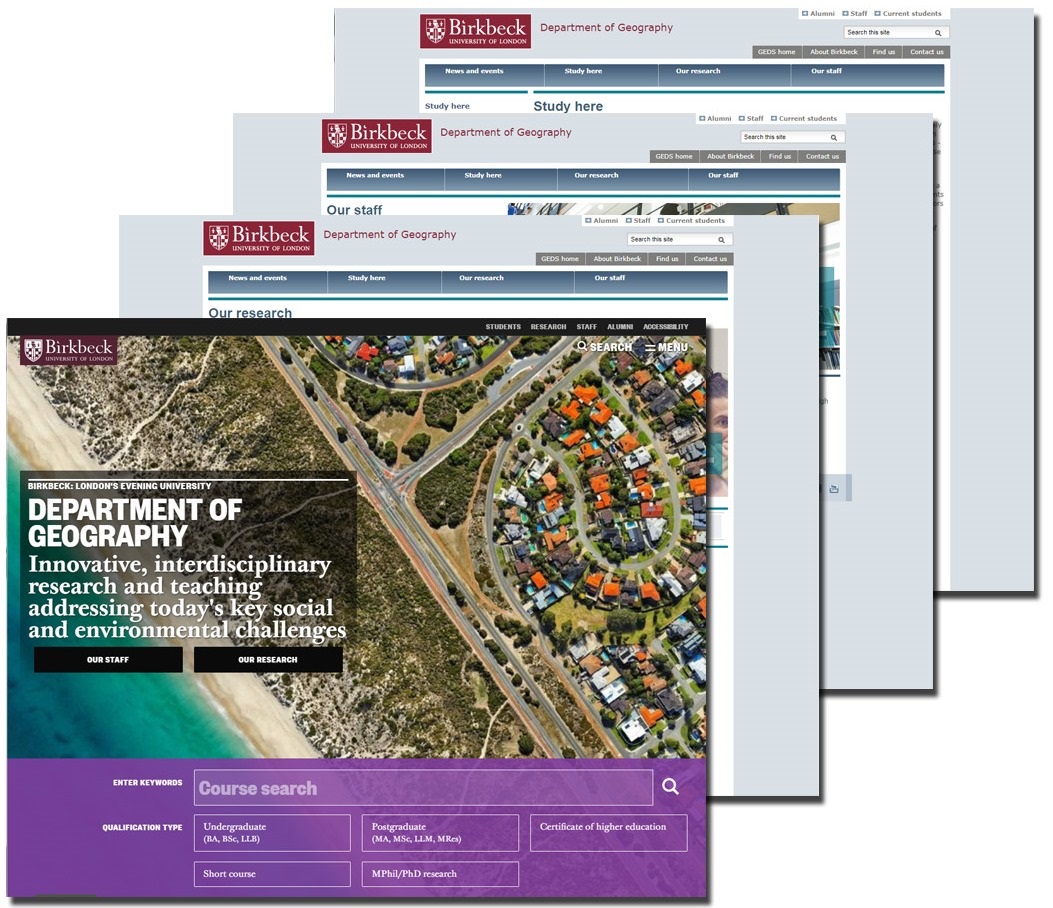
Layering our new school and department content across the Birkbeck site 

This time, we’re doing it differently.

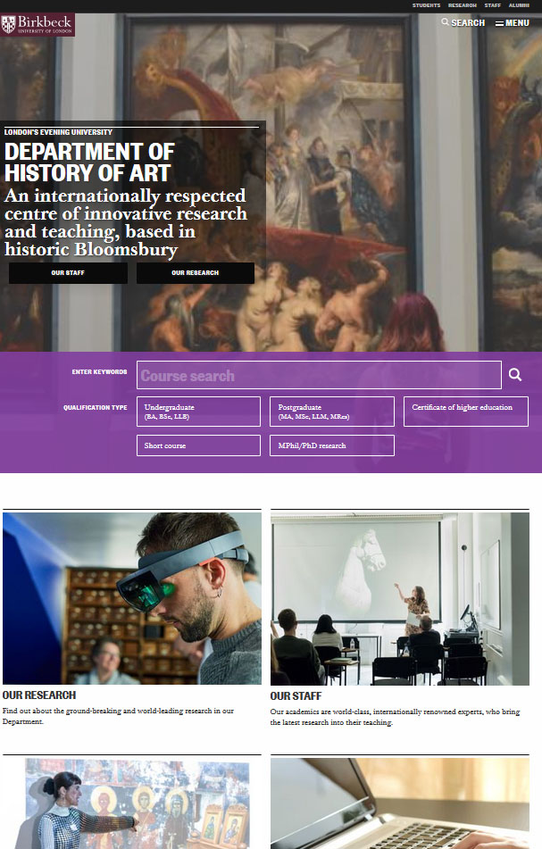
Rather than upgrading one department or school at a time, we’re tackling this project layer by layer (each layer representing a single content area), each of which will go live when it’s ready. This means that the same content layer (eg staff profiles) will go live for all relevant school/development content areas at the same time, without having to wait for entire sites to be redeveloped. (You can see the first outcome for this approach in new department wayfinding pages – which are the first priority in this project to go live.)

This does mean that, while the project is ongoing, new content pages will sit alongside old pages. Eventually, as the project goes on and more content areas go live, new content will entirely eclipse the current school and department presence on the Birkbeck website, and we will have a fully new and improved web presence for this important part of the Birkbeck community.

Web Working Group and Digital Project Team 

We know that colleagues in our schools and departments feel their web presence can be improved. That’s why we’re delighted to be working on this project. But we need to ensure that we understand their concerns and priorities. To this end, the central digital team (comprising the web team in ITS and the digital content team in External Relations) is working collaboratively with our schools and departments through two mechanisms:

  • Web Working Group: This group meets on an ad hoc basis – as we have progress to report and new projects to understand – and acts both as a sounding board and a decision-making body to enable us to make progress. This group is vital to our work, and we look forward to working with them throughout this project.
  • School web staff: Content for schools and departments is typically managed by key local web maintainers, who understand school and department priorities and concerns that are key to our web development work. We are working closely with schools to see how we can embed key members of this staff group in the project, working alongside the central team, both so they can receive full training on our new design and digital standards and also so they can act as a vital ‘pipeline’ from our school and department colleagues, to answer queries and implement changes. This also means they can take ownership of the new content as and when it goes live and help to action key updates and amendments. We are very grateful to schools for their willingness to work with us in this way.

Moratorium on school and department web access 

To ensure that we don’t miss important updates while we develop our replacement school and department web presence, from early October, we will need to remove access for school and department sites from non-project staff (so all school staff embedded with the project team will still have access and be responsible for updating their local content) with the exception of the following two areas of content (as we recognise that these are the three content areas for which local staff receive high volumes of amend requests):

  • Academic staff profiles: All staff who currently have access to update these pages will continue to have access to update academic staff information, until we are in the position of migrating the content to its new location: at this point, we will have to restrict access to the digital project team until the new systems are in place. However, we will give schools and departments advance notice of when the moratorium needs to be imposed and will do our best to ensure that the moratorium doesn’t have to last too long.
  • News stories: All staff who currently update news on school and department sites will continue to have access to add news stories, until the point at which the content needs to be migrated to the new content solution, at which point, we will need to restrict access to the digital project team. But, as with academic staff profiles, we will give schools and departments advance notice of when this will happen and will hope this moratorium won’t have to last too long.
  • Staff intranets: some school and department sites have staff intranets. These will also be exempt from the moratorium, until the point at which the content is migrated to its new content location. We will communicate with schools and departments in advance of imposing the moratorium and will figure out a good way to manage content updates in this time.

How requests for amendments will be actioned during the project 

In relation to all other content amends, these will need to be funnelled through the project team (including local school web maintainers, as explained above), ideally using the web support channel on Yammer (Yammer is part of the college’s Office 365 stable of applications and can be accessed by logging into Office 365, then selecting the Yammer app). Requests for amends will be managed as follows:

  • Content amends for accuracy will be actioned as part of our regular Fix-it Friday work and we will aim – depending on the volume of requests and the staff resource we have available on the day – to action all amends on the Friday in the week the amends are requested. We will post responses to requests for amends on Yammer, so you will know when your amend request has been actioned.
  • More significant change requests – for example, content restructuring or new navigation – will need to be fed into the web redevelopment project, to inform the work that is being done there.

This will ensure that we focus on the new developments, while continually ensuring the accuracy of our current live school and department web content.

Digital content sprints 

In addition to the central digital team and the embedded school staff, we have been given a budget to recruit freelance editors to work on this project. Everyone will become part of the Digital Transformation project team and work collaboratively to make progress. We are planning to tackle our content development work in three-week blocks. These will consist of two elements:

  • Planning and discovery: Before we start any of our projects, we will be doing some discovery work to see how people currently find and use the content and to identify relevant subject experts across the college. We will then invite these subject experts to meet the project team in a web workshop to identify the purpose and scope of the project, review an audit of the existing content, look at the way web users currently work on this content and make recommendations on how we should address the content challenge. In some cases, we will do this using user story creation, to ensure that the content we develop is user-focused and serves a user need. We will then put all of this together into a ‘sprint plan’, which will inform the actual content development.
  • Content sprints: The digital project team will develop content to meet the requirements outlined in the planning and discovery phase. This work will be concentrated into two-week periods, called sprints (excluding Fridays, which are devoted to Fix-it Friday tasks and other project team admin tasks). We will use collaborative tools, including Trello and Slack, to ensure that all members of the digital project team have access to relevant discussions and decisions, so the work can be done as efficiently as possible. (Please see Elizabeth Charles’ blog describing her experience of this project approach for an insight into how this works in practice.) All members of the project team will also be expected to join us in sprint catch-up meetings, which will be conducted via MS Teams, which will enable us to make progress, trouble-shoot issues and identify potential blockers on a daily basis. This will also mean that, where we encounter challenges, we can resolve them collectively.

Project retrospectives 

Although we have piloted aspects of this approach in our work so far, this is the first time we are using it on this scale. We need to make sure we get it right. That’s why, as we progress through this project, we will also be reviewing our progress and approach, so that it can develop to meet the specific needs of our project team and improve as we go along. Where we can, we will publish our findings, to share what we’ve learned with our colleagues across the college.

Timescale 

This is an ambitious project and, without additional resource, would normally take a minimum of 2.5 years. However, we need to finish this project much more quickly so, with the injection of additional resource, for which we are very grateful, we are aiming to upgrade all of the school and department sites over the course of the next academic year, with new content areas going live throughout this period.

What happens at the end of the project? 

Once the new school and department web presence has been finalised by the project team, responsibility for maintaining and developing it will be handed back to schools and departments, and local web maintainers will again be responsible for them.

To support these web maintainers, we will make the following support systems available:

  • Digital passport training: all staff who need to work on the Birkbeck website will receive comprehensive web training, the new ‘digital passport’, which will provide essential grounding in all aspects of web work, from learning how to maintain web content, to understanding search engine optimisation and the specific requirements of responsive websites. (School staff who are part of the digital project team will have already received this training.)
  • Quality monitoring: we subscribe to an online quality monitoring tool called Sitemorse, which scans the Birkbeck site each month, identifying usability, spelling and other web issues that need to be addressed. As part of the handback process, local web maintainers will be trained in and then deputed to receive Sitemorse reports relating to their area of the Birkbeck website.
  • Web maintainers’ meetings: we currently have and will continue to host regular meetings for all Birkbeck web maintainers, which is an essential channel of communication for us, enabling us to share updates and also address questions and concerns raised by our colleagues with web responsibilities.
  • Yammer web support group: since we set this up in 2015, our Yammer web support group has become an essential part of our web work, acting as the main communications channel for routine web amendments and updates, as well as announcements relating to systems downtime, etc. This will continue to operate both throughout the project and beyond.

Keeping up to date with the project 

According to our terms of reference, WWG members are responsible for updating their local departments/schools on the progress of and decisions made during the Digital Transformation Project.

However, we are also planning to publish blogs throughout the project to give insight into our decision-making and progress, and to explain what we’re developing and the thinking that informed the development.

We hope this will ensure that you keep up to date with this important project.


Share

Department wayfinding pages: new online doorway into our departments

The Digital Transformation Project team is pleased to announce the launch of our first priority project for the Stage 2 school and department web redevelopment project: namely, a new web wayfinding page for every department at Birkbeck. Jane Van de Ban, Web Content Manager, talks about the wayfinding page project and its implementation.

Before…

What is a wayfinding page?
A department wayfinding page is the first page someone lands on when they follow a link to, or type in the URL (web address) for, a specific department – eg www.bbk.ac.uk/ems.

Each department wayfinding page enables web visitors to find and navigate their way around department-specific information that answers their questions about what it’s like to study, research, collaborate or work in a department at Birkbeck. It provides an overview of the kind of content that will be available to them and makes it easy to get to key information via signpost links.

How did we identify what was needed for the department wayfinding pages?
At our Web Working Group (WWG)1 meeting earlier this year, we shared an analysis on what people look at on our department sites – staff information and department-specific research content.

With this in mind, our WWG members then identified a range of content they felt visitors needed to access when they landed on a department’s wayfinding page, including staff details, information on the student experience, research centres connected with the department, etc. In fact, all of the types of information that are currently featured on, or signposted from, our current department wayfinding pages.

We then asked each WWG member to design their ideal department wayfinding pages – a useful exercise that showed how much each wayfinding page had in common:

  • A large, visually arresting image
  • Signposts for key areas information:
  • staff
  • research
  • course information
  • study here
  • news
  • events
  • social media (blogs, podcasts, Facebook, Twitter)

Some of the wayfinding pages had additional elements that – in many cases – reflected local priorities – eg:

  • embedded videos
  • a ‘mission statement’ or ‘position statement’ for the department
  • calls to action (eg book an open evening, order a prospectus)

and signposts to:

  • department-related research centres
  • recent publications
  • information on working here
  • student funding information
  • fieldwork opportunities.

Objectives
It was clear that each department wanted to use their wayfinding page to meet three objectives:

  • Make it easy to find top-level content areas (our WWG members, for example, felt it was important to make it easy for visitors to find staff information and research information).
  • Make it easy to find information that is unique to individual departments (eg fieldwork opportunities in Geography and Earth and Planetary Sciences; network-learning in Organizational Psychology)
  • Convey something about the character/nature of a department.

With this guidance and based on the user requirements identified in earlier WWG meetings, we presented a design solution to the WWG, consisting of a department ‘template’ with:

  • a large and striking ‘hero’ image
  • 15 visual signposts (six top-level content areas and nine local content areas)
  • two calls to action: ‘Our staff’ and ‘Our research’
  • a short mission statement for every department
  • embedded news, events and department-specific podcasts
  • a course finder
  • an embedded video
  • a statement tile.

Using this template means that we could develop the wayfinding pages, in a timely fashion, with the resources we had and meet the objectives and requirements provided to us by the WWG.

…and after!

The structure of our wayfinding pages
Once approved, the digital team set to work to create wayfinding pages for each department – a task that took, on average, three to four days for each wayfinding page.

Each wayfinding page comprises the following elements: 

  • Hero image: for each department, we had to find a single, large, high-quality image that is both striking and suited to the area of research (while recognising that it is impossible for a single image to convey everything). It also had to fit in with the overall template and be copyright-free: no small challenge! So, for Earth and Planetary Sciences, for example, we’ve chosen an image taken by the Hubble telescope, to convey some of the exciting inter-planetary research our colleagues in that department are undertaking. For History of Art, we’ve selected a really great image of someone in an art gallery. For other departments, we have chosen more abstract images. Not all images work in that space, so it took considerable time to research and identify appropriate images.
  • Department statement: our WWG members made it very clear that, when people land on a wayfinding page, there should be text that conveys something about the department. So, we’ve written bespoke statements for each department, derived – where possible – from existing text either in the prospectus and on the web – a challenging proposition where these statements can be no more than four short lines (about 10 to 12 words). These, in combination with the Birkbeck strapline, ‘London’s evening university’, provide an immediate introductory overview.
  • Calls to action: on our homepage, we use ‘Book an Open Evening’ and ‘Order a prospectus’ as our two main calls to action. But, advised by the WWG that our departments would want to highlight staff and research, we made ‘staff’ and ‘research’ the calls to action – and added signposts further down the page to further highlight these important areas of content.
  • Course search: we’ve included the College course search on all of our wayfinding pages. Although we’re not currently able to offer a department-specific slice of course results, this is something we are building in the future and look forward to rolling out across our department sites. In the meantime, our web visitors can use this to get to course information relevant to their interests.
  • Signposts to top-level content areas: the top six signposts on the landing pages – the rectangular ones – are pretty consistent across our department sites and signpost the main topic areas on our current department sites. This replaces the horizontal navigation currently available from department wayfinding pages, so visitors can continue get to these topics easily. For images, we conducted a lot of research, looking at images of events in the Birkbeck Flickr library to find department-specific images, where possible – particularly to signpost your staff information. Where this wasn’t possible, we have used other images. In all cases, they are high-quality and optimised for the web.
  • Statement tiles: in our print prospectuses, we feature pictures of academics with quotes that relate to their subjects, as heading pages for the subjects. As they’re so striking and the quotes are so good, we thought this was a good opportunity to repurpose them and to create a visual throughline from print to the web, while also taking the opportunity to signpost the all-important staff pages again. If we haven’t used a staff image, it’s because the relevant staff member (whose picture was used in the print prospectus) is no longer at Birkbeck – once we have a new one available, we will replace it.
  • Local-priority signposts: with WWG guidance that we should use these wayfinding pages to help visitors find deep-level content (reflecting local priorities), we have included nine signposts that point to a range of content areas – from individual research centres, to student funding and local activities, such as Science Week, and facilities, such as the Peltz Gallery. We identified them through a content audit of current department content, finding out what is important by what is featured on the local web.
  • Department video: each department wayfinding page showcases a video that showcases an aspect of the department. For Psychology, for example, we embedded a ‘Day in the life…’ video, featuring Dr Emma Meaburn, one of our popular series of videos that showcase what it’s like to be a psychologist at Birkbeck.
  • News, events and podcasts/blogs: we are currently showing the generic news and events feed, which is updated dynamically. Currently, we can’t restrict the feeds to department-specific news/events, but this is also on our list and will be featured in the future; however, we are showcasing three comment features – podcasts or blogs –that are department specific.

What about the rest of my department’s site?
We know that the wayfinding pages take you to pages in the old design.

Our next priority is to redevelop the research information on our department sites (work on which has already started) and then the study here information, each of which will be launched once we’ve completed them as a ‘minimum viable product’ (MVP), with a view to testing and improving them once they’re available. The reason we’re taking this approach is to ensure that we don’t have to wait for all of the content to be redone before we launch new sites (schools and departments currently comprise around 28,000 content items, so it will take a lot of work and time to get them done).

So we’re launching these wayfinding pages as the first of these MVPs – they will change as we begin to see how our web users interact with them, and in response to improved content being made – and they are the first tranche of the overall DTP Stage 2 project that we are pleased to publish.

What about schools?
There is a separate project to look at schools, and their wayfinding pages, as the research we conducted with school and department staff during the initial consultation meetings showed us that there isn’t agreement on the function and purpose of our school web presence – some people even suggesting that they weren’t needed.

So this needs to be considered separately, once the work has been scheduled in as a priority by our Web Working Group.

Find out more
We are publishing blogs through the Digital Transformation Project, to share our progress with and the reasoning behind each of the developments we unveil.

Read some of our other blogs to find out more: 

Share

Doing digital better: what I learned from IWMW and ContentEd in 2018

Angela Ashby, Digital Editor at Birkbeck, reflects on what she learned from two conferences she attended with other members of the College’s digital content team.

I attended two web conferences recently, ContentEd and IWMW, which gave me an opportunity to learn new ideas and approaches, and to meet web colleagues who are facing the same problems as we are.

Being in that environment also allowed me to step out of my daily tasks, to assess what is important in a wider sense, to see how good web practice is evolving, and to consider which new ideas we might be able to apply.

ContentEd

The ContentEd conference is the only one in Europe that specifically addresses content strategy for the education sector, which makes it very focused and relevant to the kind of work and decisions that we are making for Birkbeck right now.

ContentEd 2018 took place in London on 14 and 15 June, and was attended by 195 delegates from 67 institutions in countries around the world, including the US, Australia, Finland and the Netherlands. Our digital content team of three from External Relations attended both days.

My takeaways

A lot of inspirational people presented at the conference, including our own Jane Van de Ban. The customer journey mapping that Birkbeck undertook in 2016 (to inform our Digital Transformation Project) is considered groundbreaking by colleagues at other institutions.

Here are the things I’ll remember.

Create once: publish everywhere. Rich Prowse from the University of Bath has revolutionised the content on their website by dividing it into discrete ‘chunks’, labelling them for reuse and publishing them in multiple locations. This seems like common sense, but it is the ultimate in having a ‘single source of truth’ on the web.

Simple language is not talking down to people – it’s respecting them by not wasting their time. Gabriel Smy is a Content Strategist from Zengenti, and this idea of his really resonated with me. Plain English and natural language are vital to make it easy for our users to read our content, both for humans and, increasingly, for machines.

Content needs to be relevant to be useful. Sarah Richards is a superstar of web content – she was the brains behind the revolutionary changes to the gov.uk website. She believes that, in order to be useful, content needs to meet a need. Therefore, she advocates creating user stories for every piece of content to justify its existence: ‘As a … [user ‘type’ or job role], I need to … [task], so that … [goal]’. She has also done a lot of research on users’ reading patterns. Regressive reading (where a reader has to jump back within a sentence to understand it properly) leads to a drop in trust. Jargon leads to regressive reading. The lessons? Ensure your writing is clear – avoid jargon.

Another, unexpected, bonus of this conference was winning a prize of a year’s subscription to GatherContent – an online content workflow tool – which will prove useful for the collaborative nature of our ongoing Digital Transformation Project.

Institutional Web Management Workshop (IWMW)

This conference was held at the University of York, 11-13 July, attended by 125 delegates, and is more wide-reaching than ContentEd. Its scope includes developers, designers and managers, as well as content creators. My team, along with web colleagues from ITS, had attended the same conference in Canterbury in 2017. Perhaps my most interesting observation was how this year’s mix of presenters and content led to a totally different experience to the year before.

The human aspect was strong this year. Two brave and personal presentations from Alison Kerwin (York) and Andrew Millar (Dundee) dealt with mental health and emotional challenges in the workplace, which resonated with what many of us have been through but don’t talk about.

Birkbeck’s Jane Van de Ban delivered the customer journey mapping presentation here, and again it was extremely well received. As a result, at least one other institution has already implemented ‘Fix-It Friday’ – an idea that we had picked up at IWMW the year before.

My takeaways

Websites are spaceships. The bigger they are, the harder to turn. Gareth Edwards (University of Greenwich): ‘Invisible labour’ can be defined as those insignificant tasks that take you away from your longer-term goals and reduce your productivity. Gareth looked at studies that quantify this phenomenon, and discovered that:

  • The average number of ‘task switches’ per day is 50.
  • If your task is interrupted, it is likely to take 266% of the time it would normally have taken.
  • You are likely to spend 31% of your time on phone calls and email per day.
  • You are likely to initiate 40% of all task switches yourself.

Thinking outside the box. Dave Musson (The Native): Dave introduced us to a number of innovative approaches that other institutions are taking, including using the natural beauty of your institution’s physical location (‘campus porn’), and Clearing gimmicks like chatbots, Pacman-style games, student social media takeovers, and geo-fenced Snapchat filters. Institutions need to stand out in order to make them memorable.

Inertia feels safe, but it’s not. Ayala Gordon/Padma Gillen (University of Southampton): In the web world, staying still is the equivalent of going backwards. We need to adapt to keep up with technology and a changing world.

Avoid ‘informational bias’. Keith McDonald (University of London): ‘Informational bias’ is bluster or jargon that gets in the way of clear communication. Don’t hide the message in unnecessary words/phrases.

Networking

And the learning didn’t end there. Chats with colleagues in between sessions gave me a chance to find out more.

  • As we are launching a project to develop research content on Department web pages, St Andrews has just completed theirs. Looking at their research, their strategy and their end result is incredibly valuable for us as an example.
  • The University of Dundee has recently completed a redevelopment of their ITS pages, getting to know processes first hand, and reducing the number of pages dramatically. We can learn from what they achieved.
  • Website hacks are a real risk. In chatting over drinks, I picked up inside information about two universities that had their websites hacked. Birkbeck needs to protect fiercely against this eventuality.

A number of the same colleagues across institutions attended both of these conferences, and IWMW last year, so networking and knowledge sharing was able to continue at IWMW 2018. There’s a real sense of community in the UK web world that makes us feel connected to higher education outside our institutions.

More generally, both conferences have ongoing communication channels available, so that delegates can continue to build this community through the year. These colleagues of ours are endlessly creative, and their generosity knows no limits.

Share

Birkbeck Library website redesign; or, my adventures in a digital transformation project

Elizabeth E. Charles, Assistant Director of Library Services, discusses the redesign of the library website. 

Today, we have launched a brand-new Birkbeck Library website, with completely revamped content, navigation and design.

The Library website has been redesigned on two previous occasions: we changed the landing page, but the content remained the same, which is like repainting your front door and landscaping the front garden, but doing nothing to the interior of the house! I hasten to add that this occurred because, every time the opportunity arose, we just didn’t have the time and it was too close to the start of another academic year.

This time, we asked Naomi Bain, the College’s user experience (UX) expert, to undertake some UX testing with Library website users. This told us some things that we already suspected or knew – there was too much text on the Library website, and it was difficult to find information – but, we also learned that the layout was confusing, alongside a number of other issues.

We knew that the main Birkbeck site had been redesigned and restructured and we liked some of the features, as did our users; so, I contacted Jane Van de Ban, Web Content Manager in External Relations, with a list of the things we would like changed on the Library website. As the Library site is the second most popular section of the entire Birkbeck website (after the online prospectus), Jane suggested that, rather than simply update our existing site, it would be worth integrating it into the new design. She asked us whether we would be prepared to undertake this as a collaborative effort. The Library web editors agreed that this would be a good opportunity to refresh our website, so we said yes!

The redesigned library website

Getting ready

Jane supplied us with a content audit and looked at traffic to the Library website in the past year. This showed us that a large proportion of the Library site was not being used, and it also told us which content was most popular with our web visitors. Jane presented us with a collaborative spreadsheet, listing all the content areas, and her advice on what to do in relation to each area. After the initial emotional reaction, we reviewed the comments and suggestions and either agreed with them or explained why we disagreed with her assessment.

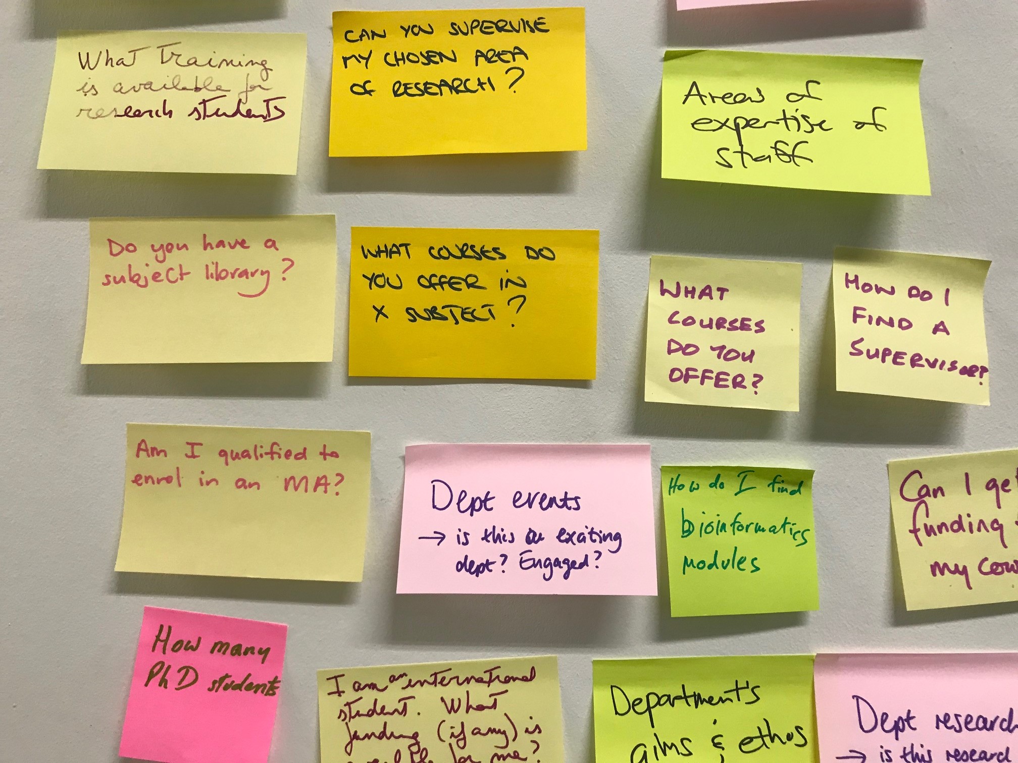
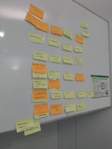
The next step was to come up with a new structure for the Library website. We were invited to a Library web workshop and, using post-it notes and sharpies, we wrote down the most common queries that we get from our users (one query per post-it note). Then we stuck them on the wall, and grouped and sorted them. We then filled in the gaps and took pictures of the grouped post-it notes for future reference. This then became the basis of the Library redesign, alongside the initial, annotated content audit.

Jane then set up a project on Trello – a collaborative project tool – with a list of tasks, organised into columns like ‘To do’, ‘Doing’, ‘To review’ and ‘Done’.

The project

Given the importance of this project to our web visitors, Jane wanted to complete the improvements as quickly as possible and asked if a member of Library staff could be seconded to the project. I volunteered, as I felt I was best placed to answer queries. So, for one day a week, starting in early April, I was scheduled to work on the website.  As homework, I had to familiarise myself with Birkbeck’s Style Guide and tone of voice guidelines, as well as other support materials provided in the digital standards section of the website. I also attended a bespoke training session, run by the External Relations web content team, then prepared to set to work.

Using the Trello project board, I chose the content areas I wanted to work on (everyone works from the same board, which means that there is no duplication of work), and my job was – for each content area – to answer the queries that came out of the Library web meeting, find all of the pages on the live Library site that related to them, then review the content and rewrite it, to meet the digital standards and to reduce the amount of text.

My first task: getting membership under control

I decided to start with our membership information. My challenge was to convert 55 separate pages to one page. Working with Ben Winyard, Senior Content Editor in External Relations, who gave me one-to-one training and advice, I rewrote and changed the formatting to match the house style, then experimented with how the information is presented.

Jane then reviewed the new page and wrote a detailed report on the format, the tone of voice, grammar and house style – I felt I had received a C+, ‘Could do better’ mark! I worked through Jane’s detailed report, addressing each point raised and making changes as necessary. This was helpful because it meant I could then review other pages to ensure the same issues didn’t crop up.

The new membership page was then moved to Ben’s list on Trello, to check that it met the requirements for the Birkbeck tone of voice and the use of plain English and active voice. He cut the text even further while ensuring that the content flowed. Then, the page was given back to me, to check that nothing crucial was missing, giving me another chance to suggest other edits.

This process meant that I received a crash course in writing for the web from a team of experienced content editors, working collaboratively, using live content. It is all well and good to read guidance notes, but quite another thing to implement them and keep to the task!

Improvements

Rewriting content wasn’t the only improvement we made to the Library site. We also improved navigation and findability of content:

  • We didn’t duplicate information that already existed elsewhere – we linked to it.
  • Forms to suggest new books for the Library and for staff to request teaching materials were converted into Apex forms and located either in My Birkbeck for Staff or in My Birkbeck for Students. So, Library users do not have to retype personal information that we already hold about them.
  • We also made huge improvements to navigation in two key areas of content:
    • Angela Ashby, Digital Editor in External Relations, reorganised the navigation for past exam papers, which had included a separate web page for each department for each year of exams – amounting to more than 200 pages. Angela cut the navigation down to 26 pages – one for each department.
    • I compressed 232 web pages listings our for databases and online resources into just one page. This was made easier by deciding to move extensive help guide information for each database into a document, which will eventually become a support manual for Library staff on the helpdesk.

Keeping Library staff updated

This has been the first opportunity I have had to fully examine the content of the existing Library website and to undertake a root-and-branch review. I focused on thinking always of what our users want/will be looking for and trying to ensure that they can visit a web page, scan it, easily find what they need, and move on. Helping users to find the resources they need without adding additional layers of unnecessary content was very important. When in doubt, I would look at the website traffic figures, the feedback from the UX testing, and the post-it notes.

After all that work had been done, the slimmed-down website was shown to Library staff and to students who attended a Student-Library Partnership meeting. The response was very positive: obviously, we were on the right track.

Creating the wayfinding page

The wayfinding, or landing, page was the last component of the project. We had more post-it-note sessions with groups of Library staff to consult with them. This enabled us to come up with an initial layout, based on a top-task analysis, to inform the order in which signpost tiles appear.

Then, I built the wayfinding page. We decided to use new photos taken last year, focusing on images of our students using the Library.

Redirects

Before we could go live with the new website, we had to create a comprehensive list of redirects, to ensure visitors following old links ended up on new content. This was a huge task, which ended with 1700 redirects (and, wouldn’t you know, I also got to help with that, too).

Looking forward

We have already requested UX testing to ensure that we have not overlooked anything, to pick up on any issues, and to provide evidence to make informed decisions on any further changes/tweaks to the Library website before the beginning of the 2018–19 academic year.

Conclusion

It has been a challenging and stimulating experience. But, I have learnt a great deal from the External Relations web content team and I can honestly say, I now understand what is required to write for the web in a consistent and engaging fashion. I’ve also learned the importance of optimisation for search and paying consideration to where our users would expect to find the information they are looking for. I also know the whole of the Library website intimately, and I will continue to learn and retain my newly acquired skills, through continuous practice and actively reviewing the content on our website.

My thanks to Jane, Ben, Angela, Emlyn, Steve, Naomi, John and Outi and the Library Web Group and the Library staff for their support and for providing feedback at the drop of a hat.

Share

Digital Transformation Project (DTP) stage 2: improving the school and department presence on the Birkbeck web 

Jane Van de Ban, Web Content Manager for Birkbeck, shares progress and updates on the second stage of the College’s web redevelopment project. This blog is one of a series of blogs about Birkbeck’s Digital Transformation Project

Following the successful launch of Stage 1 of our web redevelopment project (prioritising public-facing recruitment pages), we concentrated on making further improvements to our redeveloped web pages, to continue to improve these pages for our prospective students.

We have now launched Stage 2 of the DTP, turning our attention to school and department content on the Birkbeck website.

  1. Requirement-gathering with the schools

This project began during October and November 2017 with ER and ITS facilitating five workshops, one for each school. The aim was to gain a greater understanding of the challenges and priorities for school, department and research centre content, from the point of view of those working in the schools. The facilitators also spoke about the project, by invitation, at a variety of other school and department meetings.

At the workshops, ER and ITS facilitators gave participants an overview of the website transformation project work so far, including some of the evidence and research behind the work already  undertaken. We then presented attendees with data about how our current school and department content is consumed by visitors (such as the most popular content), and we watched recordings of students visiting the school and department sites and talking about what information they are trying to access and the barriers to completing their online journey with us.

Workshop attendees discussed university websites that they thought handled school and department content particularly well, before we began an in-depth exploration of school and department content – what it does, should do, could do better. Participants were given as much time as they wanted to add notes under a range of headings, including issues with current content, and priorities for school, department and research centre content.

When everyone felt they had got all their points down, the facilitators invited contributors to expand on their notes, generating a group discussion about the topics attendees felt were most pressing, helping to draw out commonalities, outliers and voices. Minutes were recorded to capture the conversations, questions and concerns raised by participants at each workshop and the post-it notes were photographed.

1.1 Workshop discussions – recurring topics across all five schools

Staff across the College shared similar concerns. Unsurprisingly, better navigation and good, up-to-date content constantly cropped up as high-level concerns and priorities. In addition, our attendees talked about:

  • Staff profiles: These are by far the most visited area of school and department content and, thus, demand attention. Much discussion centred on questions of audience, degrees of standardisation and information management – who will update the content and how they will connect with other systems that academics use, such as BIRon.
  • Design: By far one of the greatest concerns for the project across all schools was the visual appeal and imagery of the school and department web content.
  • The web as ‘shop window’: A good deal of time was spent discussing how to showcase the best that Birkbeck’s schools, departments and research centres have to offer. There was a unanimous desire for space to show off news, events, research impact and other activities. Some schools felt that this would help garner a deeper sense of community between students and staff.
  • Showcasing department individuality: Finding the right balance between heterogeneity with the ‘corporate’ site, while allowing the personality of each department to shine through was important.
  • What role do schools play on the Birkbeck web? There were mixed opinions on the necessity of keeping school content. Some participants argued that the school is merely an internal managerial structure that does not have much relevance to the outside world, while others thought we might be missing a trick by not giving space to school-level events, news and rankings. Some consideration still needs to be given to identifying the target audience.
  • Information for current students: there was a mixed reaction to the necessity for having a section for current students in certain schools. Some departments use the current students section for essential information such as handbooks and module timetables, while others do not have a current student area at all (eg Law). This also sparked much discussion of what should be behind the current student log-in area, ‘My Birkbeck’.
  • Maintaining web standards: Finally, many participants were concerned about who will take responsibility for ensuring web content is kept up to date while maintaining consistency and how this will be resourced. Most thought that some collaboration was required between professional services and the school and department-based staff, to ensure consistency across the website while keeping content fresh and distinct.

2. The launch of the Web Working Group

Now that we have completed the initial consultation and we have a good grasp of what staff across the schools are most concerned about, we have begun working with the Web Working Group (WWG), consisting of key staff (academic and professional support) from all five schools.

The aim of this group is for the digital transformation team (comprising the ER and ITS digital teams, and our project managers, Kayleigh Woods Harley and Richard Evemy) to work collaboratively with school / department staff (academics and professional support staff who represent their schools) to redevelop the school and department content on the Birkbeck website, informed by the workshop discussions with the wider group.

  1. ‘Layering’ the new look and feel on to our school and department content

But how best to redesign this important part of the Birkbeck website? The overall look and feel of our school and department web presence will take its cue from the ‘new’ Birkbeck visual identity, which – a year into its life – is now being used extensively by every school and professional service for everything from new architectural designs for Estates to event posters and prospectuses. But what is the best way to apply the new visual identity and digital standards to our school and department web presence?

In previous years, when we upgraded school and department microsites, we did this on a site-by-site basis, which meant it took a long time for the latest design to roll out across our school and department sites. This was obviously frustrating for the departments lower down our list (which were upgraded more than a year after the first upgraded site went live). So, this time, we are taking a different approach. Rather than improve one site at a time, we are going to target specific parts of or topics on each site (eg research information, staff profiles) and, with the guidance of our WWG, we are aiming to go live with the new parts for all school/departments at or around the same time.

This means that ‘old’ and ‘new’ designs will co-exist for the school and department web, but we believe this disadvantage will be outweighed by the fact that the whole of our school and department web will feature ‘layers’ of improvements, which will – over time – eventually take over, until all of the ‘old’ content has been transformed for the better.

After our first two meetings with the WWG, we have not only started to work on two project layers, but we have identified a series of other projects that we will need to tackle:

3.1 Department gateway pages

For many staff, the most important page on a department site is the gateway page (in effect, the homepage of your department). So, rather than start with other parts of our site, we decided this would be our first priority and the first ‘layer’ to be applied.

Our aim is to develop new ‘gateway’ pages for all of our departments (school content and gateway pages will be addressed in a separate ‘schools’ project – see 3.3) that will better enable visitors to access key information, in the new design. To do this, we need to analyse feedback we’ve received from the initial web workshops with schools, the WWG meetings, and our ongoing user testing, in order to determine the requirements for our department gateway pages. We will then share our findings and results with the WWG. After this, we will develop new pages for all of the departments, with a view to getting sign off from local heads of departments (ideally, with the support of the local WWG representative).

Once we have reached this stage, we will apply this first ‘layer’ to our department content.

3.2 Academic and research staff pages

Academic and research staff pages are critical for our users, but currently they are riddled with problems and errors – a lack of consistency in respect of the type of information we present, out-of-date information, duplicate content, concerns about design and layout, etc. This is obviously of great concern to the Birkbeck community as well as ourselves. So, we need to ensure that we make this content as good as it can be.

Among other actions we need to take to improve our academic and research staff profiles, we need to:

  • Complete our analysis of requirements gathered through user testing and the WWG discussions, to inform our planning
  • Develop a comprehensive list of ‘fields’ (contact details, links to personal websites and profile information on academic.edu, LinkedIn, etc.) that apply to all academic and research staff, while providing a mechanism whereby academic staff themselves decide which of these fields should be presented on their part of the Birkbeck website
  • Consider the best way to maintain and update this information
  • Think creatively about how we can ensure that this important information is embedded with other key parts of the Birkbeck web (eg our course listings, where we need to let visitors know which of our staff teach on which courses)
  • Do a better job of rationalising our sources of information to avoid duplicate content updates on the Birkbeck site – so, for example, we need to pull information from BIRon into our staff profiles, rather than providing duplicate (and, inevitably, out-of-date) publication information pages.

After all of this, we will be able to identify the way in which we can implement this project and will discuss this with the WWG. Then we will be able to plan the appropriate stages of development for this project.

3.3 Other projects

We have also identified a range of other projects that need to be addressed in this stage (in no particular order – and probably not a comprehensive list):

  • Department research: this project will concentrate on how we can best present information on a department’s research – their aims and objectives, their activities and their outcomes.
  • Search and discovery: we know that Birkbeck’s search – course and site search – needs to be improved. This project is going to ensure that we make it easier for our web visitors to find the information they need when they are on the Birkbeck web.
  • Departmental student experience: what is it like to study in a department? What is the student experience? This project aims to address these questions and more, to give prospective students a better understanding of what it will be like to study at Birkbeck in a specific department.
  • Student funding: we know that prospective students don’t always find all the funding information that might be relevant to their studies, so we need to do something to make this information both easier to find and comprehensive. That’s what this project is about.
  • Prospective Phd students: we know that department sites are critical for prospective PhD students, and we could improve their experience. This project will look at providing the information that Phd students need in order to make the decision that Birkbeck is right for them.
  • Current students: this project will look at the best way to provide information for current students.
  • Course information: we know it’s important to let our visitors know what courses each department offers, because staff have told us this and the WWG reinforced this. This project will concentrate on how we can and should provide this information.
  • Business services / partnership project: this project will consider how best to make this important information visible to our stakeholders.
  • Schools project: in our workshops, some staff told us that school information isn’t necessary on the Birkbeck web; others told us that we needed to find a better way to showcase school information. With this project, we will need to tackle this and come up with a solution that works for everyone.

We are reliant on the WWG to help us prioritise these projects and to help us to understand the requirements better, so that each project can be tackled on a stand-alone basis and layered successfully across the Birkbeck web.

  1. When is this all happening?

Currently, the Birkbeck school and department web comprises more than 27,000 discrete items of publicly indexed content (ie content available via a Google search). Transforming this quantity of content into something better (all of which will need to be reviewed with much content either rewritten or deleted, in consultation with local content owners) is a massive undertaking, and we are only at the start.

However, this is an important project to us, and we are keen to make progress. So, although we can’t tell you exactly when your ‘old’ pages will be improved, we are aiming to go live with new layers throughout the year and we will continue to use blogs to tell you more about the reasoning behind our decisions and, once we have plotted the timeline, when we are hoping to deliver them.

Share

Enhancing content on the Birkbeck website

Birkbeck’s Digital Editor Angela Ashby discusses how the web team are working to improve the quality of the College’s website.

Photo credit: Paul Cochrane

The digital content team in External Relations (ER) had a quandary: with a large and growing website, multiple contributors, and not enough resources to keep eyes on every page, how could we possibly monitor and maintain the quality of the website? We expected there to be broken links, which are inevitable over time, and we had created and published a style guide to keep our content consistent, but we needed both a big-picture view of the site and a way to focus our attention in order to make best use of our time.

Sitemorse

With the help of our technical colleagues in Corporate Information and Web Systems (CIWS), we explored various solutions and agreed that an online governance tool called Sitemorse would meet our needs best.

Sitemorse sends us monthly reports that pinpoint various aspects of pages that need attention and score us on issues falling into themes such as accessibility, function/links, search engine optimisation (SEO) and metadata (descriptive page tags). Sitemorse has also allowed us to build in rules that tell us when our pages don’t follow our own style guide and shows us where and how the content can be improved. These rules include decisions on abbreviations, email and phone format, italics, ampersands and link text.

Each new Sitemorse report shows our scores and ranking clearly improving for the pages that we’ve worked on. For instance, the Student Services area went from 5.7 out of 10 in December 2017 to 6.4 in January 2018. It’s a slow process, as each error needs to be individually corrected, but in the last four months, we’ve already fixed over 1000 broken links. It is still early days, but we will watch with interest to see whether errors approach zero over the long term. Our goal is to bring each section to at least a score of 7.0 out of 10.

Web maintainers meetings and Yammer

If you are the only person in your department working as a web maintainer, it’s possible to feel isolated. You are definitely not alone, though – there are at least 30 web maintainers working within Birkbeck, and we saw a need to create a community so that web maintainers feel part of a wider team, with common goals.

Our first step was to invite all web maintainers from around the College (including our Moodle colleagues) to meet every two months as a group. At meetings, the central web team shares details of projects and progress and encourages all web maintainers to raise any issues or queries, and to share their own best practice.

This inclusive approach is continued via an enterprise networking tool called Yammer. All web maintainers are encouraged to join the ‘Web support’ group, and any posted queries and requests for edits are dealt with by the relevant members of the central digital team in a way that benefits the whole community.

Another way that the central digital team extends its support to web maintainers is to invite anyone working on particular web projects to come and ‘hotdesk’ in ER, where we can offer more personalised support and collaboration.

Contact Jane Van de Ban if you’re a web maintainer and you’d like to join the group.

Fix-it Friday

The ER digital content team receives dozens of requests each week from around the College to update content on various web pages. Since our May 2017 go-live for the central pages, we’ve completed more than 200 separate pieces of work. This is in addition to the intensive improvement work we carried out on programme and module pages last year.

In order to fit this ‘quick-fix’ work in with our longer-term ongoing projects, we have initiated ‘Fix-it Friday’, where we schedule in requests that have come to us during the week. We can almost always complete small pieces of work on the next available Friday. If a request involves a larger project, such as a new set of pages, then we can discuss with the project owner how to prioritise the work over a longer period.

We prefer to receive work requests via Yammer, as it’s possible for emails to be overlooked during staff absences. To join Yammer, log in to Office 365, find the Yammer app and select to open it. Search for the ‘Web support’ group and click join. We’ll approve your request.

Training in 2018

So far, the newly designed central web pages have been maintained by the digital content team in ER. This is because we are planning briefings and a comprehensive training programme to ensure that web maintainers have the tools and the confidence to update pages in the new template. Once staff members have completed the training, they will be able to edit and maintain pages, with ongoing support from the content team.

Current and future projects

We are currently working with schools and departments, via a new Web Working Group, to scope and plan requirements for the improvement of department pages, in particular, the very important staff profile pages. We are also planning the improvement and migration of professional service pages to the new web design, beginning with Estates and Facilities, IT services and the library, with HR and the Registry Office to follow.

Like all the improvements made so far, these projects are focusing on users, the questions they need answers to and the journeys they want to make at Birkbeck. We continue to base our work and decisions on evidence and user-testing, adjusting our approach as necessary.

Share

Launching Birkbeck’s Event Toolkit

Birkbeck staff Siobhan Morris and Lucy Tallentire discuss the new Event Toolkit – a new resource to advise Birkbeck staff and students in organising, promoting and evaluating events. This toolkit will complement the work of the events team, who will continue to organise College-wide events.

Events, Communications, Public Engagement, and Impact staff from across the College have recently designed and created an Event Toolkit to offer general advice for all kinds of events, from conferences and academic workshops, to memorial dinners and book launches. This toolkit will complement the work of the events team, who will continue to organise College-wide events. It has been designed primarily for staff at Birkbeck to provide them with a practical resource to help run a successful event from start to finish, however, the toolkit may also be useful for postgraduate students and interns.

The toolkit is comprised of six sections, each providing a wealth of guidance, top tips and resources for planning, organising, and evaluating an event.

The sections focus on the following key areas: Why and Who, Logistics, Event Promotion, and Evaluation. In addition, the toolkit features a series of case studies designed to showcase best practice, as well as indicate potential challenges that may arise during the planning or delivery of an event. A list of Resources and Contacts is also included, providing evaluation templates, details of key contacts within the College, and links to further information.

More information on the toolkit’s content and layout is available in the video below:

The Event Toolkit team have been delighted with how the resource has been received so far, with comments noting that the toolkit is a ‘fantastic resource, it’s so comprehensive’ and that it contains ‘loads of information but it can be dipped in and out of’.

The toolkit will continue to be reviewed and updated periodically in order to ensure that the information provided remains accurate and up to date. We therefore welcome any feedback, suggestions or comments that you may have. Please get in touch with us through the feedback form in our Contacts section of the website. We hope you enjoy exploring the toolkit!

Explore the Event Toolkit here: http://www.bbk.ac.uk/staff-information/event-toolkit

Share

The changing role of Birkbeck’s website homepage

Jane Van de Ban, Web Content Manager for Birkbeck, gives insight into the functionality and strategic design behind our new homepage. Read part one and part two in our blog series about the redesign project.

We launched the new Birkbeck website six months ago and, since that time, one of the areas that has sparked a lot of conversation is the homepage – the ‘bbk.ac.uk‘ page that traditionally would have functioned as our ‘virtual’ front door.

Colleagues from across the College have been very curious about the changes that have been made to the homepage – and rightly so. Along with a lot of very positive responses – about the modern design, clear navigation and sense of purpose for both recruitment and research – some concern has also been expressed. This is understandable – we have made a drastic change from what went before.

So I thought it would be worth dedicating this latest edition of our series of blog posts about Birkbeck’s digital transformation project, to exploring this subject in a little more depth, explaining the evidence and rationale behind the design route we have taken.

The concerns that colleagues on our campus have expressed largely cluster around three issues: long pages; use of large images; and the loss of the carousel – a filmstrip of images that you can click through.

The ‘above the fold’ myth
Some people are worried that the introduction of long pages on content might put off visitors, who they imagine do not want to scroll down a lengthy page. This concern is sometimes expressed as ‘our content needs to be above the fold’.

There is a persistent, outdated belief that all of our most useful content needs to be available ‘above the fold’ on the homepage or people simply won’t find it. Some folk imagine that web users won’t scroll. This was certainly the case in the 20th century when mass web use was in its infancy (and on desktops), but is no longer true.

The term ‘above the fold’ comes from the world of printing presses and ink, where newspapers ensured their best story was featured on the top half of the paper so, when folded in half for the newsstand, the front-page lead story could easily be seen by passersby.  This concept carried over to the web, where people equated the bottom edge of their browser window to the fold in a newspaper. Some colleagues are worried that, a bit like those newsstand customers, web visitors will simply scan the headline and, if not presented with every key messages at a glance, they will walk on by.

This certainly used to be the case, but the web and how people use and interact with it has changed dramatically with the rise of mobile.

  1. The fold has moved – different devices have different viewing screens, and the ‘fold’ on my desktop is not the same as the ‘fold’ on my iPhone. Nor is it the same as the fold on my colleague’s Android phone or the fold on another colleague’s iPad. The relevance of the ‘fold’ as a strict guide for web design – and the injunction to ensure your most important content is above it – faded at the point at which people regularly started using devices other than their computers to access the internet (last year, visitors used more than 6000 different devices to access our website). This doesn’t mean the fold is entirely irrelevant, but it does mean web design in relation to it has had to change.
  2. Scrolling is now normal web behaviour. In the 90s, scrolling was not normal for web users and websites lacked the sophistication of functionality available today.

Here’s what the Birkbeck website looked like in January 1999.
At that time, we didn’t ask people to scroll, but our website was tiny and not even the place most people turned to find out about us. Imagine this – Google was only founded in 1998! Like many other websites in the 90s, it mostly comprised text that was uncomfortable to read on screen.

Now, thanks to the proliferation of devices with small screens that people use to access the web, along with advances in readable screen technology and the advent of social media channels that require you to scan lots of content, people have not only learned how to scroll and read online, but scrolling has become the norm. This means we no longer have to put all of our most important information above the fold – indeed, we’re no longer expected to – which means we can be more flexible when it comes to homepage design.

Where did the carousel go?
Since we launched the new homepage, some people have mourned the loss of the carousel – the sliding set of images that used to adorn the top of the homepage. They are concerned that, with the loss of the carousel, we no longer convey the unique character of Birkbeck at a glance.

When we were working with Pentagram, our design agency, to develop our new homepage, we had long discussions about whether the carousel should stay or go: we were initially resistant to the idea of losing it. After all, it was an efficient way to showcase lots of information about Birkbeck in one space, wasn’t it? Actually, no it wasn’t.

It turns out that web carousels aren’t working for website users, but internal audiences love them. So, while we thought people were finding out all about Birkbeck from the rotating images and messages in the carousel, in fact, our visitors weren’t interested at all: they did not always see them; scrolled past them; went straight to our course finder; or noticed just one image and followed that link. Our carousel was giving us a false sense of security and, as a result, we were not working hard enough to ensure our visitors understood what Birkbeck was about.

This chimed with findings from our customer journey mapping research, where students told us that, even though they trawled our website enthusiastically (some of them claimed to have visited ‘hundreds of times’), they weren’t necessarily aware of our core offering or our ‘unique selling points’, in marketing parlance.

For example, some did not realise we offered evening teaching as the norm: they thought it was just an option and that we were a daytime university. Nor did they realise how well respected we are for our research, both nationally and internationally. Or that our NSS results can really shine. Our researchers told us that we ‘hide our light under a bushel’ and we absolutely needed to do more to share our unique characteristics and our successes with our web visitors, the majority of whom only ever engage with us online.

Our new homepage design

When we commissioned Pentagram to come up with a new web design with and for us, based on our new visual ID, we knew we wanted to showcase Birkbeck effectively. We knew – because Birkbeck staff and students told us – that the Birkbeck website didn’t work for our visitors as well as it might and that it looked dated and staid.

Pentagram took time to understand our objectives, our concerns and the feedback we had received from staff and students before devising this list of design principles to inform our new web design:

  1. Simplify and clear away clutter
  2. Push up content and reduce steps
  3. Connect content and surface a story on every page
  4. Create hierarchy
  5. Don’t be afraid of long pages

We know that people don’t read every word on our homepage – in fact, not everyone sees our homepage but goes straight to a particular page as directed by a search result. But if our visitors do choose to travel down it (and a lot of them do), they will encounter a number of elements that tell them more about the type of institution Birkbeck is:

  • Hero image: this is the big image that loads whenever someone visits our homepage. We have deliberately chosen an image that is both large and striking, because we know this is one way to attract the attention of our visitors and, yes, encourage them to explore. But it isn’t just the size and quality of the image – this image also conveys something about Birkbeck, buttressed by the message ‘Join London’s evening university and transform your life’. And now that we have one image to grab people’s attention, we make sure it works hard. (For example, one of our previous images – a bus driving past the SSHP buildings in Russell Square – tells people that we are in the heart of historical London.)
  • A prominent course finder: we have emblazoned our course search across our homepage, after the hero image. Why? Because the art of a successful homepage is to enable visitors to get to where they want to go, quickly. In the last academic year, people pulled up our course information 6m times, so we know this is important to them. Our course finder makes it quick and easy for them to find our course information – and by including all the level options, they can see that our courses span the breadth of higher education offerings.
  • Research stories embedded across our site: We are proud of Birkbeck’s research profile and know how important it is to Birkbeck staff that we tell people about it. To help us share our research stories more widely, we have embedded news, events and blogs/podcasts on all of our landing pages – not just our homepage – including our course listings. This means our research information – which comprises the bulk of these channels – is accessible almost anywhere people travel on the redesigned pages – and by showcasing our research through these different channels, we are giving people loads of ways to engage with it.
  • Obvious USPs: no more hiding our light under a bushel. Our new image-based ‘statement tiles’ give us the chance to tell visitors about Birkbeck and what makes us unique. On our homepage, for example, we tell people that ‘Birkbeck is different: our classes are held in the evening so you can fit study into your life and build your future’. But this isn’t the only message on our site (because we know that our homepage isn’t the only place people look for information about us) – on our ‘About us’ landing page, we tell visitors that Birkbeck is ‘A leading research university and vibrant learning community’; and so on. If someone engages with our website, they should be in no doubt that we are a unique evening teaching institution with a world-class research reputation, and our statement tiles are designed to reinforce this message.

But that’s not all. In addition to these elements, you will find that we offer routes to destinations across our site through large visual signposts; that accessibility is at the heart of our design and our Reciteme bar means all visitors can access our information more easily; and that our redeveloped pages are responsive, which means they change, depending on the size of the browser you are using to access them, in order to provide an optimal browsing experience.

Is our homepage working the way we wanted?

Two of the objective set for Stage 1 of the Digital Transformation Project were to:

  1. Support student recruitment by making it easier for prospective students to navigate our site.
  2. Better promote our research.

Since the new pages and design went live on 16 May, we have seen a number of results that suggest that we are meeting these objectives. For example, compared to the period immediately before the go-live, prospectus requests have gone up 200%, Open Evening registrations 70% and applications 50%. And we’ve seen a 130% increase in views of our research content.

Of course, we know these results aren’t solely due to the work we did on the web, as these objectives are shared by colleagues across the college, and we work collectively to achieve them. However, we can at the very least be reassured that our website is helping us to meet these objectives and, as we track user engagement with our site (through user testing and the use of online tools like Hotjar), we can see that it is now easier than ever for our users to find the content they need to decide to study with us – and we can also see that they are engaging with our content in the way that we hoped (watch this video of someone reading our home page).

It’s early days and there’s still a lot to do and a lot to learn – but the work undertaken so far has greatly improved the website for our users and who are now able to quickly and efficently find out about Birkbeck and what we offer.

Share

Birkbeck’s Digital Transformation Project

Ben Winyard, Digital Publications Officer at Birkbeck, discusses Stage One of our online redesign.

Stage one of Birkbeck’s ambitious Digital Transformation Project went live on 16 May 2017, with the launch of a bold new design and layout for our homepage, corporate site and online prospectus. Since then, External Relations and the ITS Web Team have busily continued with improvements that, while less dramatic in terms of immediate, aesthetic impact, are just as important for bettering the user experience, optimising the accessibility of our website for all users, and making sure visitors can get the information they want quickly and easily.

A core principle of the Digital Transformation Project is that our decisions should be evidence-based and user-focused. In pursuit of this goal, we regularly test users’ responses to our website. Since February 2017, we have run around 50 user testing sessions, which covered the pre-launch, launch and post-launch phases of stage one. Some initial changes we made as a result of user feedback were adjustments to styling and making information clearer and easier to find.

During the June user testing sessions, we looked at how users search for courses and judge their quality, using Google, UCAS, and other comparison and rating sites. As a result, we implemented improvements to usability on our online prospectus, including: rewording and redesigning buttons and signposts; adding links to other available years of entry and to other versions of the same course (‘Related courses’); retitling fields to make browsing easier; and adding career destinations information (pulled from Unistats) to all of our full-time undergraduate courses.

As well as identifying usability issues, regular user testing is also increasing our understanding of how people use our website, which informs future developments. This feedback is proving vital for the next part of the Digital Transformation Project, which is focused on improving our site and course search. We know that the majority of our visitors come to us via Google. But we have learned that an increasing number of visitors – especially younger users – primarily navigate our site via internal course and site search, or externally through Google, rather than using our menus. This makes it even more pressing to ensure our search facility is the best it can be, which is one of our primary aims for the immediate future. User testing sessions in August concentrated on course and site search; they confirmed that improvement is needed and provided vital information on how users expect a search facility to work on a university website.

We are also looking at how students use school/department content on the Birkbeck website and how this content fits into the user journey. This is with a view to launching a project to bring our school/department content into the new visual identity and web design, which will also include rationalising and improving content and navigation, in order to enhance the user experience and ensure all of our users can find the information they need.

In External Relations, our focus so far has been on improving our online prospectus, the most visited and the most important part of our entire website. Depending on the time of year, our online prospectus can total well over 4000 pages, each with its own unique content and each playing a vital role in telling prospective students about Birkbeck and encouraging them to apply. Improving our online prospectus has two strands: rewriting descriptive text for our courses and improving all of the modules that are currently available for undergraduate and postgraduate students. In both instances, we have been applying our new house style and polishing content to make our course and module descriptions accurate and engaging. Our primary aim with any online course description is to grab the reader’s attention and let them know about what is unique, interesting and exciting about the course and about Birkbeck.

An example of a programme page in our new design.

On our programme pages, we have focused attention on the overview, highlights and course structure fields. We know from heat maps and analytics that these are the most visited parts of every programme page, so we wanted to dedicate time and attention to making this text really sing. It’s important to us that we do justice to the intellectually stimulating content of our courses, to the dedicated, world-leading academics who teach them, and to the life-changing opportunities offered by Birkbeck’s unique model of evening study. We have also been working hard with colleagues to ensure our online course pages are compliant with new legal requirements from the Competition and Markets Authority (CMA). These changes will increase the usefulness of our online prospectus by presenting important information on student contact hours, independent learning, learning development and support, and how students are taught and assessed across Birkbeck.

Our module improvement project has one primary focus: ensuring that every available module at Birkbeck is part of our online prospectus and includes rich, appealingly written descriptive text that adheres to our new house style. We have been working closely with our colleagues across Birkbeck’s five schools to source content and have updated and improved around 200 modules so far.

So, what difference has our redesign made, in terms of the number and quality of visits? An important measure of improvement and quality is the increased amount of time people are spending on our site; visitors spend longer engaging with the improved content and are finding it easier to navigate between different areas. There has also been an increase in the number of returning visitors, so we know that people are coming back to us.

Our online prospectus remains the focus of most visitors’ attention and continues to attract the highest interest. User testing and analytics reveal that, for many visitors, our course pages are their first interaction with Birkbeck, so one of our primary aims with the new web design has been to convert each of our online course pages into a ‘mini-homepage’, with links to news, events and research across Birkbeck and to vital information, such as financial support, student services and accommodation. To this end, we added tertiary signposts to every programme page and we are now seeing that people use our course pages as their main entry route into, and the jumping-off point to, other parts of the Birkbeck website. Other parts of our site have been dramatically upgraded: there are far fewer pages and we have consolidated information in one place and converted old information into downloadable documents, where appropriate. This has led to a significant increase in engagement: visitors are now spending more time on these pages and going through the information more thoroughly, because it’s all in one place and easily navigable.

Meanwhile, we have instituted a regular weekly maintenance slot, during which three web editors in External Relations make requested changes to all areas of our new site. Since May, we have implemented hundreds of such requests, all with the purpose of improving the accuracy and helpfulness of our content.

We have also developed an entirely new Digital Standards area on our website, which provides advice, information and support to all Birkbeck staff who need to convey information online. You can read our house style guide, find out about search engine optimisation, get practical information on links, files and redirects, and learn more about our visual identity and our social media guidelines. We are working hard to supplement this online support with bespoke face-to-face training, which we are in the process of developing. We have also begun using new software that identifies accessibility, content and coding issues across our site, which is greatly helping us continually maintain and improve the new site.

We have a series of ‘conversion goals’ on our website, whereby a user’s visit is translated into an action. We primarily want visitors to: order a prospectus; or book an Open Evening; or submit an application to study. We have seen a dramatic increase in these since we launched the new website, so it is pleasing to see that our work continues to support and advance the primary objectives of the Digital Transformation Project.


Share

The story behind Birkbeck’s new web design

Dr Ben Winyard, Senior Content Manager at Birkbeck explains the research and process behind our website’s new look. 

The Birkbeck website serves many vital functions simultaneously: it must be an authoritative, accurate source of information; a gateway to services; easy to navigate and search; aesthetically pleasing; accessible to all; and it must reflect and advance Birkbeck’s mission. The experience of using our website is often absolutely central to a person’s decision to come and study in the evening with us.

In our digital age, having a professional, beautifully designed and practical, easy to use website is absolutely essential for any university or organisation. Users need to get where they want to be quickly and easily, feeling confident that what they’re reading is accurate, while enjoying the tactile and visual experience of moving through our site.

The Birkbeck Digital project is a hugely ambitious, wide-ranging and on-going project to redesign, redevelop, restructure and re-present Birkbeck’s web presence based on research, evidence and over 50 user-testing sessions. Every longstanding website – and Birkbeck has been online for around twenty years – has a natural history of expansion and growth. The ambition of this project has allowed us to research and reconsider everything about our site – the design, the layout, the navigation and the content – and the opportunity to field staff and student feedback to ascertain how people use, and feel about, our website.

The project has been divided into stages, as the Birkbeck website extends to many thousands of pages. Stage 1, which is being delivering on schedule this month, includes the redesign of the Birkbeck homepage, of our ‘corporate’ site, which includes all of the key information for prospective students and covers many of our most important professional and student services departments, and, lastly, the online prospectus, which includes over 3000 pages of course and module information across all levels of study, from short courses to PhD research.

Our first task was to organise user feedback sessions, to help us map and improve the experience of visitors to the website. A series of workshops, one-to-one interviews and group sessions, were bisected by ‘type’ of user, from ‘young undergraduate’ and ‘mature postgraduate’ to international students, MPhil/PhD researchers and staff from across the College.  From this research we were able to compile a rich analysis of who is using the Birkbeck website, what they are looking for, and what delights and frustrates them. This invaluable feedback has informed every step of the design process, the reviewing and refreshing of content and the build of the new website.

The feedback was often interestingly divided according to the age of the student: in general, users above the age of 30 were positive, describing our website as ‘modern’, ‘clear’, ‘precise’, ‘professional’ and ‘mature’; while younger users were less positive, describing our website as ‘traditional’, ‘outdated’, ‘plain’, ‘dull’ and lacking colour and media content such as videos. Many users expressed frustration with the navigation on our site – the menus, signposts and links that you click on to move from one page or section of the website to another – and felt we don’t adequately convey what it is like to study at Birkbeck. Users also struggled to access vital information, including bursaries and financial support.

Embedded accessibility software, including screen-reading, enables visitors to customise our site in the way they need it to work

Embedded accessibility software, including screen-reading, enables visitors to customise our site in the way they need it to work

The task of converting all of this, sometimes conflicting, feedback into a new design fell to the design company, Pentagram, who created our new visual identity last year so had a head start in understanding Birkbeck’s unique mission and our diverse staff and student community. Over the course of many brainstorming sessions and meetings in the autumn of 2016, Birkbeck’s content (External Relations) and technical (IT Services) experts worked together with Pentagram to translate our new visual identity and user feedback into a stylish, clear and colourful new design.

The mammoth task of translating Pentagram’s beautiful designs into a functioning website fell to our hugely talented and hardworking CIS & Web Team in IT Services. This type of translation work – of turning a design into functioning code on a webpage – will always involve cutting your coat to match your cloth – i.e. working out what can be done given the challenges of schedule, staff capacity and budget. The developers were astute at breaking down each element of the design and explaining the best way of turning them into a digital reality. Extensive user-testing was carried out in the team as well as research to makes sure our site is sector-leading in terms of accessibility. This sort of cross-team working carries its own challenges, but IT Services and External Relations have worked strongly and successfully together.

The new pop-out menu

The new pop-out menu signposts visitors to important pages

This new design has adapted our visual identity for the Web, incorporating new typography and standards of layout. On the redesigned Homepage, we now have the images, clear, graphic signposts to important pages that users have asked for, brought together on a new, easy-to-use pop-out menu on the right-hand side of the page.


Finding a course is usually the number one task of a new visitor to our site, so we have incorporated a prominent keyword course search box at the top of the Homepage, to get students started on their journey as quickly and easily as possible. We’re also showcasing the best of what’s happening at Birkbeck – as a lot of user feedback articulated a sense that Birkbeck is ‘hiding its light under a bushel’ and not trumpeting its achievements and strengths. So we are featuring news, events, blog posts and podcasts on the Homepage and on landing pages, singing loudly and proudly about our world-class research.

research-tile

Birkbeck’s unique qualities are showcased with eye-catching statement tiles

Birkbeck’s unique mission makes us genuinely different to other universities and the new website is all about making this clear upfront, celebrating it and helping prospective students see the many ways in which studying with us could have a real impact on their lives. We are also making videos more prominent, as a way of telling our unique story and dusting away some of the fustiness that frustrated our younger users. Finally, the new website has been designed responsively, meaning that, whatever device you are using, the website will look great and be easy to use.

newwebsite6phone

The website is optimised for browsing on any device

On our online prospectus, we are presenting each course page as a gateway into Birkbeck, as many prospective students come to our website through our course pages after a Google search. Thus, we now include links to important information on fees and funding, making an application, entry requirements, accommodation, our research culture and other key areas of interest for prospective students, depending on the level of study. We have also reviewed the content on all of our course pages, stripping out duplication and generic content and simplifying, consolidating and improving.

Redesigning and restructuring the website gave us a golden opportunity to review, assess and edit our content. The pages on our ‘corporate’ website include absolutely crucial information on fees and funding, student services, careers and employability, and research, while our online prospectus is the most visited area of our website and absolutely central to attracting new students.

Like most organisations, Birkbeck has seen its website expand exponentially over the past decade and, as with any large, complex organisation, content on our website has not always been kept up-to-date or focused on the needs of users. Seizing this opportunity, we have reviewed and refreshed over 1500 items of content, which includes webpages, images and files, in line with the newly created House Style and tone of voice guidelines – the first time Birkbeck has ever had a comprehensive style guide.

Duplicate and obsolete material has been removed, written content has been reviewed, rewritten where necessary, and adjusted to meet our House Style. User testing and workshop sessions with content owners across the College mean that we have been able to reorder material based on user needs, giving prominence to the material that matters most to visitors and giving answers to their most pressing questions. Areas of the website that had been structured to reflect the internal organisation of Birkbeck have been reordered to bring users’ needs, questions and tasks to the forefront. Thirty new landing pages have been created, giving essential content areas a fresh, vibrant new look that also makes the website easier to navigate.

Throughout this process, when considering the design, layout, structure and content of the website, we have been guided by the following ideas and principles:

  1. To focus on and prioritise the needs of the website users, whether staff, students or visitors.
  2. To simplify, clarify and reduce, while avoiding duplication, obfuscation and verbiage. Our written content should be truthful, clear, concise and easy to understand.
  3. To ensure our site is accessible to all users and optimised to enable disabled, blind and visually impaired users to access the information they need.
  4. To increase the aesthetic appeal of the website, particularly through the greater use of images, videos and other media. To this end, nearly 600 new images have been uploaded to the site.
  5. To simplify the structure of our website, to enable ease of navigation and quick access to the information that users need.
  6. Apply our new House Style and deploy a more consistent, positive and appealing tone of voice.

And this is just the beginning. Going forward, we will be redesigning and relaunching other parts of our website, utilising new technologies, implementing new principles of digital governance, rolling out our new House Style and tone of voice guidelines, and working towards the shared goal of a website we can all feel justly proud of.

Share