Dr Ben Winyard, Senior Content Manager at Birkbeck explains the research and process behind our website’s new look.
The Birkbeck website serves many vital functions simultaneously: it must be an authoritative, accurate source of information; a gateway to services; easy to navigate and search; aesthetically pleasing; accessible to all; and it must reflect and advance Birkbeck’s mission. The experience of using our website is often absolutely central to a person’s decision to come and study in the evening with us.
In our digital age, having a professional, beautifully designed and practical, easy to use website is absolutely essential for any university or organisation. Users need to get where they want to be quickly and easily, feeling confident that what they’re reading is accurate, while enjoying the tactile and visual experience of moving through our site.
The Birkbeck Digital project is a hugely ambitious, wide-ranging and on-going project to redesign, redevelop, restructure and re-present Birkbeck’s web presence based on research, evidence and over 50 user-testing sessions. Every longstanding website – and Birkbeck has been online for around twenty years – has a natural history of expansion and growth. The ambition of this project has allowed us to research and reconsider everything about our site – the design, the layout, the navigation and the content – and the opportunity to field staff and student feedback to ascertain how people use, and feel about, our website.
The project has been divided into stages, as the Birkbeck website extends to many thousands of pages. Stage 1, which is being delivering on schedule this month, includes the redesign of the Birkbeck homepage, of our ‘corporate’ site, which includes all of the key information for prospective students and covers many of our most important professional and student services departments, and, lastly, the online prospectus, which includes over 3000 pages of course and module information across all levels of study, from short courses to PhD research.
Our first task was to organise user feedback sessions, to help us map and improve the experience of visitors to the website. A series of workshops, one-to-one interviews and group sessions, were bisected by ‘type’ of user, from ‘young undergraduate’ and ‘mature postgraduate’ to international students, MPhil/PhD researchers and staff from across the College. From this research we were able to compile a rich analysis of who is using the Birkbeck website, what they are looking for, and what delights and frustrates them. This invaluable feedback has informed every step of the design process, the reviewing and refreshing of content and the build of the new website.
The feedback was often interestingly divided according to the age of the student: in general, users above the age of 30 were positive, describing our website as ‘modern’, ‘clear’, ‘precise’, ‘professional’ and ‘mature’; while younger users were less positive, describing our website as ‘traditional’, ‘outdated’, ‘plain’, ‘dull’ and lacking colour and media content such as videos. Many users expressed frustration with the navigation on our site – the menus, signposts and links that you click on to move from one page or section of the website to another – and felt we don’t adequately convey what it is like to study at Birkbeck. Users also struggled to access vital information, including bursaries and financial support.
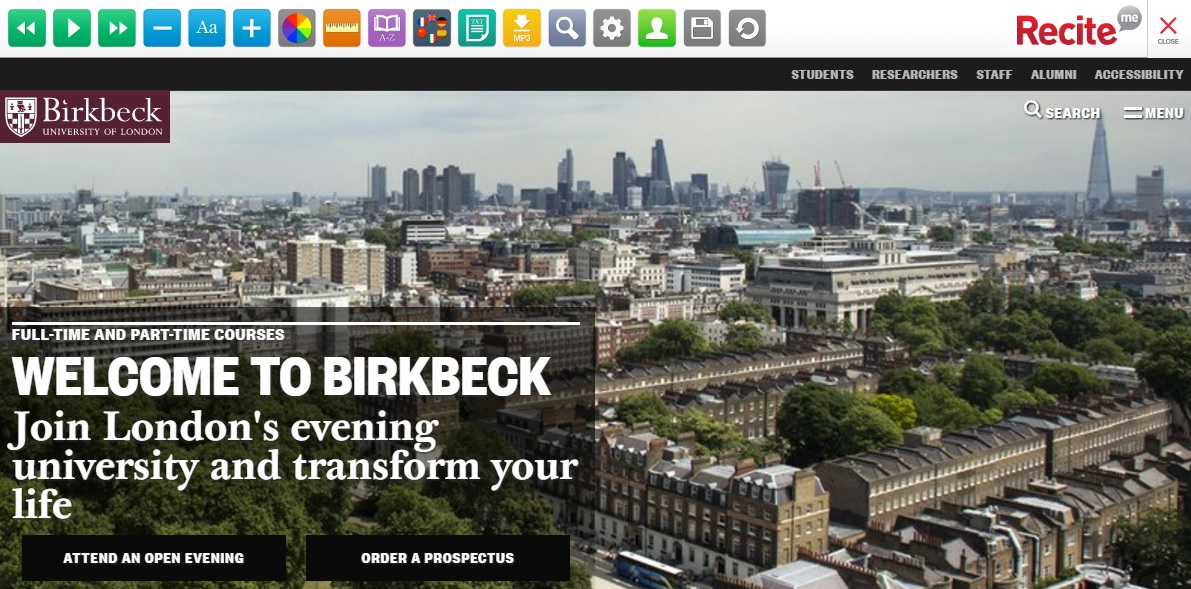
Embedded accessibility software, including screen-reading, enables visitors to customise our site in the way they need it to work
The task of converting all of this, sometimes conflicting, feedback into a new design fell to the design company, Pentagram, who created our new visual identity last year so had a head start in understanding Birkbeck’s unique mission and our diverse staff and student community. Over the course of many brainstorming sessions and meetings in the autumn of 2016, Birkbeck’s content (External Relations) and technical (IT Services) experts worked together with Pentagram to translate our new visual identity and user feedback into a stylish, clear and colourful new design.
The mammoth task of translating Pentagram’s beautiful designs into a functioning website fell to our hugely talented and hardworking CIS & Web Team in IT Services. This type of translation work – of turning a design into functioning code on a webpage – will always involve cutting your coat to match your cloth – i.e. working out what can be done given the challenges of schedule, staff capacity and budget. The developers were astute at breaking down each element of the design and explaining the best way of turning them into a digital reality. Extensive user-testing was carried out in the team as well as research to makes sure our site is sector-leading in terms of accessibility. This sort of cross-team working carries its own challenges, but IT Services and External Relations have worked strongly and successfully together.
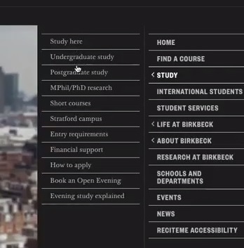
The new pop-out menu signposts visitors to important pages
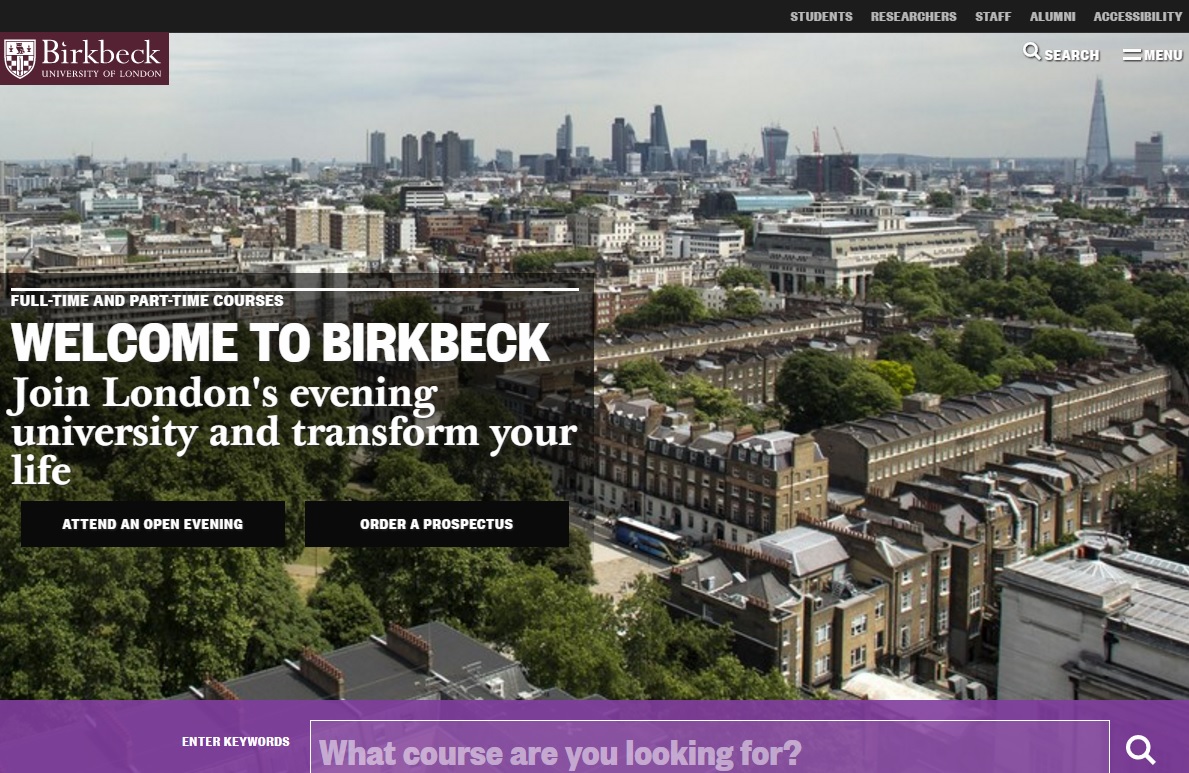
This new design has adapted our visual identity for the Web, incorporating new typography and standards of layout. On the redesigned Homepage, we now have the images, clear, graphic signposts to important pages that users have asked for, brought together on a new, easy-to-use pop-out menu on the right-hand side of the page.
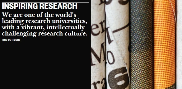
Finding a course is usually the number one task of a new visitor to our site, so we have incorporated a prominent keyword course search box at the top of the Homepage, to get students started on their journey as quickly and easily as possible. We’re also showcasing the best of what’s happening at Birkbeck – as a lot of user feedback articulated a sense that Birkbeck is ‘hiding its light under a bushel’ and not trumpeting its achievements and strengths. So we are featuring news, events, blog posts and podcasts on the Homepage and on landing pages, singing loudly and proudly about our world-class research.
Birkbeck’s unique qualities are showcased with eye-catching statement tiles
Birkbeck’s unique mission makes us genuinely different to other universities and the new website is all about making this clear upfront, celebrating it and helping prospective students see the many ways in which studying with us could have a real impact on their lives. We are also making videos more prominent, as a way of telling our unique story and dusting away some of the fustiness that frustrated our younger users. Finally, the new website has been designed responsively, meaning that, whatever device you are using, the website will look great and be easy to use.
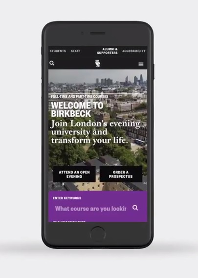
The website is optimised for browsing on any device
On our online prospectus, we are presenting each course page as a gateway into Birkbeck, as many prospective students come to our website through our course pages after a Google search. Thus, we now include links to important information on fees and funding, making an application, entry requirements, accommodation, our research culture and other key areas of interest for prospective students, depending on the level of study. We have also reviewed the content on all of our course pages, stripping out duplication and generic content and simplifying, consolidating and improving.
Redesigning and restructuring the website gave us a golden opportunity to review, assess and edit our content. The pages on our ‘corporate’ website include absolutely crucial information on fees and funding, student services, careers and employability, and research, while our online prospectus is the most visited area of our website and absolutely central to attracting new students.
Like most organisations, Birkbeck has seen its website expand exponentially over the past decade and, as with any large, complex organisation, content on our website has not always been kept up-to-date or focused on the needs of users. Seizing this opportunity, we have reviewed and refreshed over 1500 items of content, which includes webpages, images and files, in line with the newly created House Style and tone of voice guidelines – the first time Birkbeck has ever had a comprehensive style guide.
Duplicate and obsolete material has been removed, written content has been reviewed, rewritten where necessary, and adjusted to meet our House Style. User testing and workshop sessions with content owners across the College mean that we have been able to reorder material based on user needs, giving prominence to the material that matters most to visitors and giving answers to their most pressing questions. Areas of the website that had been structured to reflect the internal organisation of Birkbeck have been reordered to bring users’ needs, questions and tasks to the forefront. Thirty new landing pages have been created, giving essential content areas a fresh, vibrant new look that also makes the website easier to navigate.
Throughout this process, when considering the design, layout, structure and content of the website, we have been guided by the following ideas and principles:
- To focus on and prioritise the needs of the website users, whether staff, students or visitors.
- To simplify, clarify and reduce, while avoiding duplication, obfuscation and verbiage. Our written content should be truthful, clear, concise and easy to understand.
- To ensure our site is accessible to all users and optimised to enable disabled, blind and visually impaired users to access the information they need.
- To increase the aesthetic appeal of the website, particularly through the greater use of images, videos and other media. To this end, nearly 600 new images have been uploaded to the site.
- To simplify the structure of our website, to enable ease of navigation and quick access to the information that users need.
- Apply our new House Style and deploy a more consistent, positive and appealing tone of voice.
And this is just the beginning. Going forward, we will be redesigning and relaunching other parts of our website, utilising new technologies, implementing new principles of digital governance, rolling out our new House Style and tone of voice guidelines, and working towards the shared goal of a website we can all feel justly proud of.