Professor Sue Konzelmann explores the history of corporate purpose and its potential to support small business growth.
Ever since the Limited Liability Act of 1855, UK companies opting for that status have effectively owned themselves, and in the process, acquired a legal identity of their own. This of course, begs the question of what sort of identity – or personality – that should be, an idea that underpins the concept of organisational branding, and the wider question of corporate purpose.
People who are obsessed with money, tick-box checking or espousing values that they do not – or cannot – live up to, tend to have rather limited popularity. It’s not so very different for businesses, with the likely effect of having a negative impact on customer retention and the ability to recruit the best talent, not to mention damaging effects on the environment in which they operate.
Corporate purpose encompasses many of the same questions; but it takes a wider perspective than organizational branding, including questions such as “what are businesses actually for; and how should they relate to society and the environment?”
Corporate purpose is not a new idea. The purposes of early companies were typically public, such as building cathedrals and universities and developing much-needed economic infrastructure including transportation and finance. But by the turn of the twentieth century, for most businesses of the time, corporate purpose had shifted decisively from public to private.
Following the First World War, however, the question of whether companies should serve a public purpose was reawakened by the huge uncertainty accompanying a world depression, recurring financial crises, rapid social change, growing inequality and, of course, a devastating pandemic. If any of this sounds familiar, it’s hardly surprising that the question of corporate purpose is now firmly back on the agenda. It also strongly suggests that we didn’t get the answers right the last time we thought about it – and that we should do better this time round.
So, if it’s not about having a laser-like focus on money and doesn’t refer to window dressing, then what exactly is corporate purpose?
What it’s not may be easier to define. It’s certainly not a rigid ‘one size fits all’ approach; and perspectives often vary with role. The CEO of the world’s largest asset management company, BlackRock’s Larry Fink, for example, in his 2019 Letter to CEOs, suggested that:
“Purpose unifies management, employees, and communities. It drives ethical behavior and creates an essential check on actions that go against the best interests of stakeholders. Purpose guides culture, provides a framework for consistent decision-making, and, ultimately, helps sustain long-term financial returns for the shareholders of your company.”
In the same year, the Business Roundtable published its own perspective – a “new Statement on the Purpose of a Corporation”, signed by 181 CEOs. In it they declared that companies should serve not only their shareholders, but also deliver value to their customers, invest in employees, deal fairly with suppliers and support the communities in which they operate.
What then does all this mean, and why does it matter to SMEs? Well, with confidence in both politicians and businesses shakier than it’s been in at least half a century, defining how your business fits in is a great way to maintain the confidence of your customers, people and the places where you operate. That will do long term sustainable development no harm at all. And with SMEs often being more agile than their larger corporate counterparts, as well as contributing massively to both employment and the UK’s economy, this is clearly an area where smaller businesses can take the initiative, and drive forward positive change.
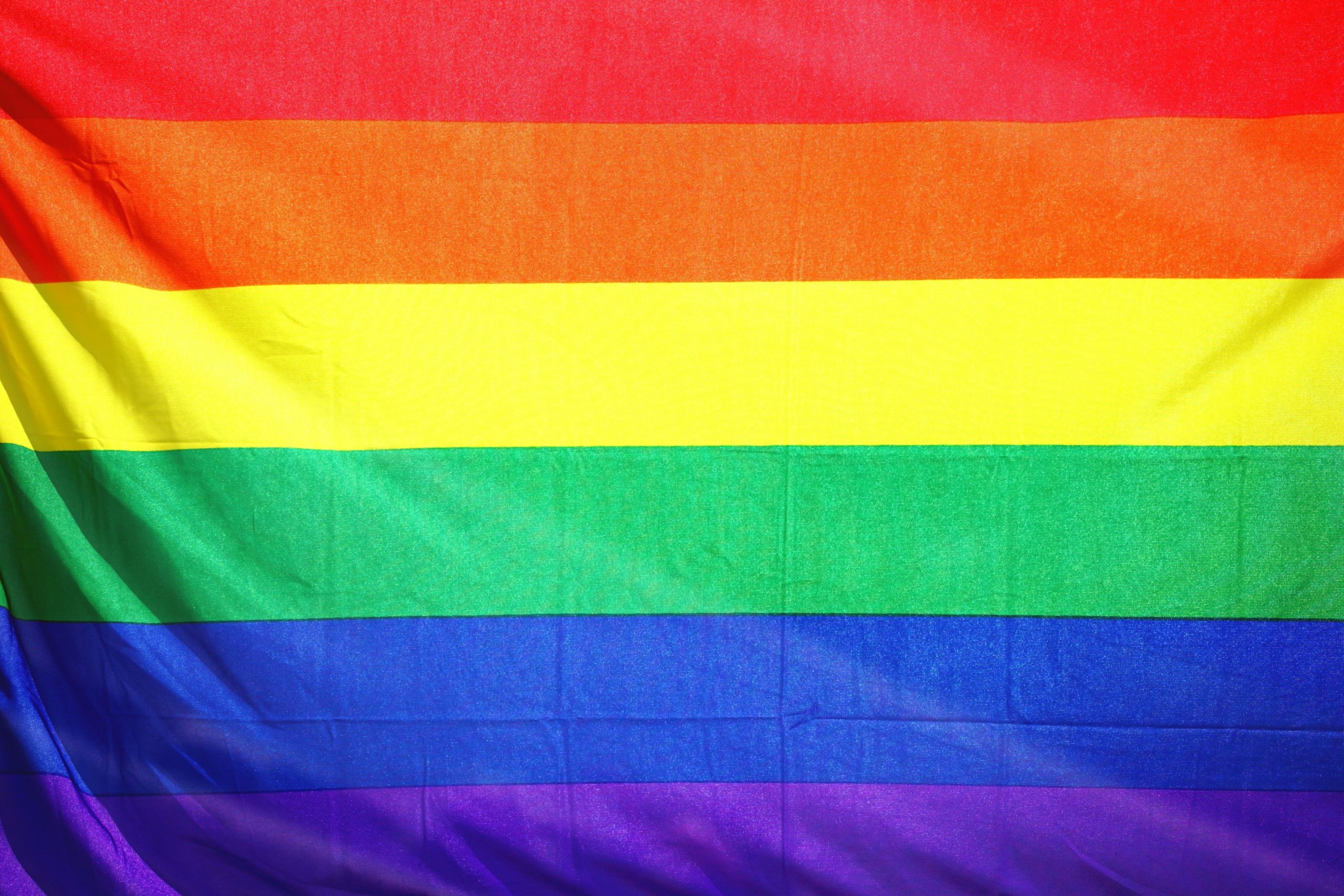
With Pride Month becoming increasingly commercialised, Dr Olivier Sibai, Lecturer in Marketing at Birkbeck, University of London, Dr Mimoun, Lecturer in Marketing at the Business School (formerly Cass), and Dr Achilleas Boukis, Lecturer in Marketing at the University of Sussex discuss how brands are engaging with the month of celebration.
It’s June again, the first heatwave has arrived, flowers are blooming, and more and more rainbow avatars appear on your social media feeds! Yes, it’s Pride Month again and brands won’t let you forget it! As everyone celebrates Pride, brands won’t stop showing their surface-level love and support to position themselves as socially progressive and increase their resonance with their younger audience. From brands’ rainbow LinkedIn profile picture to Google Doodles, every brand and its neighbor are jumping on the occasion to demonstrate their virtue. Yet, people are not so easily fooled and criticism abounds! Between accusations of rainbow-washing, blog posts wondering whether we can escape the commercialisation of Pride, and lists of brand’s “Pride fails,” consumers show their disapproval vocally.
Our research recently published in Psychology and Marketing uncovers how consumers interpret brands’ LGBTQ+-related support and decide on whether to condemn or to approve them. We show that consumers are more likely to condemn brands as ‘woke-washers’ if they are unable to prove morally competent. Specifically, media and consumers make up their minds on the biggest corporates by assessing such performative acts of allyship through three moral criteria: sensitivity, vision, and integration.
Moral sensitivity — a brand must recognize the moral content of a situation as failure to do so is likely to damage customer satisfaction, customer-brand relations, and brand equity. For example, by posting straight characters walking over the rainbow flag, Disney has proved morally insensitive to the stigma and discrimination that LGBTQ+ individuals are still experiencing in many instances.
Moral vision — a brand must show a clear moral vision when outlining challenges to free speech that help solve problems for markets and society as failure to do so results in brands being dubbed as ‘conformists’ — those who reproduce the dominant moral judgments about what is acceptable to say publicly. While Mattel still shows a lack of moral vision by mostly reproducing mainstream discourses around gender and diversity, it at least shows some moral integration with the launch of gender-neutral Barbie dolls in 2019 followed by the launch of the UNO Play with Pride edition this year (alongside $50,000 donated to the It Gets Better Project).
Moral integration — a brand must have the ability to pursue their moral beliefs in all situations as failure to do so results in brands being dubbed as ‘opportunists’ and ‘fame-seekers’ — manipulating the boundaries of free speech to serve personal interest rather than reform morality. For example, despite sharing the positive experience of its LGBTQ+ staff members, Pfizer demonstrates a lack of moral integration by simultaneously funding anti-gay politicians.
But let’s not despair, some brands have understood the point of Pride Month and, in doing so, further the fight for LGBTQ equity and inclusivity. For example, over the last few year (moral integration), Skittles celebrates Pride Month with a limited-edition Skittles Pride Packs (gray packaging and all gray candies) to emphasize the rainbow visual as a symbol of the LGBTQ+ community (moral sensitivity), alongside donation of $1 from each pack to GLAAD.
So has Pride Month just become another branded holiday? Well, it’s not for us to settle. But what we can tell you is how to judge the genuineness of branded communication: evaluate the brand’s moral sensitivity, vision, and integration. While we can condemn the over-commercialisation of Pride Month, the good news is that these branded discourses, whatever their values and intent, still raise awareness of the LGBTQ+ cause and normalize and legitimize its presence in public discourse.
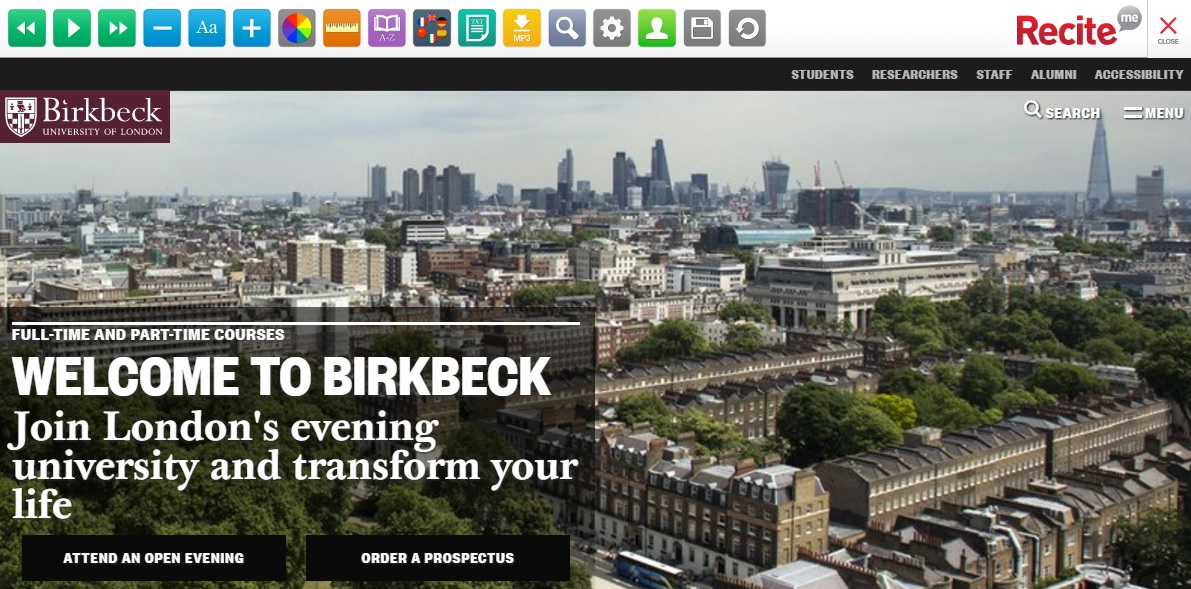
Dr Ben Winyard, Senior Content Manager at Birkbeck explains the research and process behind our website’s new look.
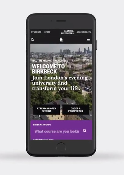
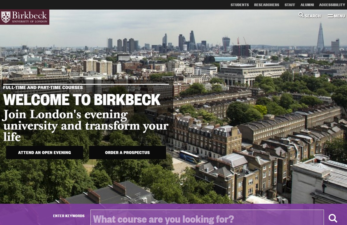
The Birkbeck website serves many vital functions simultaneously: it must be an authoritative, accurate source of information; a gateway to services; easy to navigate and search; aesthetically pleasing; accessible to all; and it must reflect and advance Birkbeck’s mission. The experience of using our website is often absolutely central to a person’s decision to come and study in the evening with us.
In our digital age, having a professional, beautifully designed and practical, easy to use website is absolutely essential for any university or organisation. Users need to get where they want to be quickly and easily, feeling confident that what they’re reading is accurate, while enjoying the tactile and visual experience of moving through our site.
The Birkbeck Digital project is a hugely ambitious, wide-ranging and on-going project to redesign, redevelop, restructure and re-present Birkbeck’s web presence based on research, evidence and over 50 user-testing sessions. Every longstanding website – and Birkbeck has been online for around twenty years – has a natural history of expansion and growth. The ambition of this project has allowed us to research and reconsider everything about our site – the design, the layout, the navigation and the content – and the opportunity to field staff and student feedback to ascertain how people use, and feel about, our website.
The project has been divided into stages, as the Birkbeck website extends to many thousands of pages. Stage 1, which is being delivering on schedule this month, includes the redesign of the Birkbeck homepage, of our ‘corporate’ site, which includes all of the key information for prospective students and covers many of our most important professional and student services departments, and, lastly, the online prospectus, which includes over 3000 pages of course and module information across all levels of study, from short courses to PhD research.
Our first task was to organise user feedback sessions, to help us map and improve the experience of visitors to the website. A series of workshops, one-to-one interviews and group sessions, were bisected by ‘type’ of user, from ‘young undergraduate’ and ‘mature postgraduate’ to international students, MPhil/PhD researchers and staff from across the College. From this research we were able to compile a rich analysis of who is using the Birkbeck website, what they are looking for, and what delights and frustrates them. This invaluable feedback has informed every step of the design process, the reviewing and refreshing of content and the build of the new website.
The feedback was often interestingly divided according to the age of the student: in general, users above the age of 30 were positive, describing our website as ‘modern’, ‘clear’, ‘precise’, ‘professional’ and ‘mature’; while younger users were less positive, describing our website as ‘traditional’, ‘outdated’, ‘plain’, ‘dull’ and lacking colour and media content such as videos. Many users expressed frustration with the navigation on our site – the menus, signposts and links that you click on to move from one page or section of the website to another – and felt we don’t adequately convey what it is like to study at Birkbeck. Users also struggled to access vital information, including bursaries and financial support.
Embedded accessibility software, including screen-reading, enables visitors to customise our site in the way they need it to work
The task of converting all of this, sometimes conflicting, feedback into a new design fell to the design company, Pentagram, who created our new visual identity last year so had a head start in understanding Birkbeck’s unique mission and our diverse staff and student community. Over the course of many brainstorming sessions and meetings in the autumn of 2016, Birkbeck’s content (External Relations) and technical (IT Services) experts worked together with Pentagram to translate our new visual identity and user feedback into a stylish, clear and colourful new design.
The mammoth task of translating Pentagram’s beautiful designs into a functioning website fell to our hugely talented and hardworking CIS & Web Team in IT Services. This type of translation work – of turning a design into functioning code on a webpage – will always involve cutting your coat to match your cloth – i.e. working out what can be done given the challenges of schedule, staff capacity and budget. The developers were astute at breaking down each element of the design and explaining the best way of turning them into a digital reality. Extensive user-testing was carried out in the team as well as research to makes sure our site is sector-leading in terms of accessibility. This sort of cross-team working carries its own challenges, but IT Services and External Relations have worked strongly and successfully together.
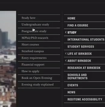
The new pop-out menu signposts visitors to important pages
This new design has adapted our visual identity for the Web, incorporating new typography and standards of layout. On the redesigned Homepage, we now have the images, clear, graphic signposts to important pages that users have asked for, brought together on a new, easy-to-use pop-out menu on the right-hand side of the page.
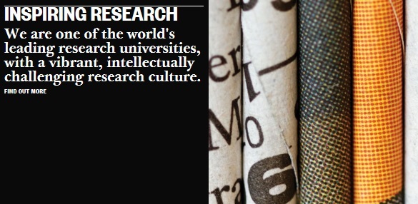
Finding a course is usually the number one task of a new visitor to our site, so we have incorporated a prominent keyword course search box at the top of the Homepage, to get students started on their journey as quickly and easily as possible. We’re also showcasing the best of what’s happening at Birkbeck – as a lot of user feedback articulated a sense that Birkbeck is ‘hiding its light under a bushel’ and not trumpeting its achievements and strengths. So we are featuring news, events, blog posts and podcasts on the Homepage and on landing pages, singing loudly and proudly about our world-class research.
Birkbeck’s unique qualities are showcased with eye-catching statement tiles
Birkbeck’s unique mission makes us genuinely different to other universities and the new website is all about making this clear upfront, celebrating it and helping prospective students see the many ways in which studying with us could have a real impact on their lives. We are also making videos more prominent, as a way of telling our unique story and dusting away some of the fustiness that frustrated our younger users. Finally, the new website has been designed responsively, meaning that, whatever device you are using, the website will look great and be easy to use.
The website is optimised for browsing on any device
On our online prospectus, we are presenting each course page as a gateway into Birkbeck, as many prospective students come to our website through our course pages after a Google search. Thus, we now include links to important information on fees and funding, making an application, entry requirements, accommodation, our research culture and other key areas of interest for prospective students, depending on the level of study. We have also reviewed the content on all of our course pages, stripping out duplication and generic content and simplifying, consolidating and improving.
Redesigning and restructuring the website gave us a golden opportunity to review, assess and edit our content. The pages on our ‘corporate’ website include absolutely crucial information on fees and funding, student services, careers and employability, and research, while our online prospectus is the most visited area of our website and absolutely central to attracting new students.
Like most organisations, Birkbeck has seen its website expand exponentially over the past decade and, as with any large, complex organisation, content on our website has not always been kept up-to-date or focused on the needs of users. Seizing this opportunity, we have reviewed and refreshed over 1500 items of content, which includes webpages, images and files, in line with the newly created House Style and tone of voice guidelines – the first time Birkbeck has ever had a comprehensive style guide.
Duplicate and obsolete material has been removed, written content has been reviewed, rewritten where necessary, and adjusted to meet our House Style. User testing and workshop sessions with content owners across the College mean that we have been able to reorder material based on user needs, giving prominence to the material that matters most to visitors and giving answers to their most pressing questions. Areas of the website that had been structured to reflect the internal organisation of Birkbeck have been reordered to bring users’ needs, questions and tasks to the forefront. Thirty new landing pages have been created, giving essential content areas a fresh, vibrant new look that also makes the website easier to navigate.
Throughout this process, when considering the design, layout, structure and content of the website, we have been guided by the following ideas and principles:
To focus on and prioritise the needs of the website users, whether staff, students or visitors.
To simplify, clarify and reduce, while avoiding duplication, obfuscation and verbiage. Our written content should be truthful, clear, concise and easy to understand.
To ensure our site is accessible to all users and optimised to enable disabled, blind and visually impaired users to access the information they need.
To increase the aesthetic appeal of the website, particularly through the greater use of images, videos and other media. To this end, nearly 600 new images have been uploaded to the site.
To simplify the structure of our website, to enable ease of navigation and quick access to the information that users need.
Apply our new House Style and deploy a more consistent, positive and appealing tone of voice.
And this is just the beginning. Going forward, we will be redesigning and relaunching other parts of our website, utilising new technologies, implementing new principles of digital governance, rolling out our new House Style and tone of voice guidelines, and working towards the shared goal of a website we can all feel justly proud of.
Naomi Bain, Web Officer (Training and User Experience), at Birkbeck explains the way student feedback informed our new web design.
Over the course of the past few months, throughout the redevelopment of the Birkbeck website, I have carried out more than 50 user testing sessions. These have sought to ensure that the changes and improvements we are making to the website are firmly rooted in research and evidence about how the website is used in real life, rather than how we might imagine it is used.
After each round of testing I reported back to the web teams, both technical and content, about any issues that came out of the sessions. These reports led to some changes being made, helped with decision-making processes and provided reassurance.
There have been four rounds of testing with students, gathered with the help of Team Birkbeck. As well as this, I set up sessions with students with dyslexia and related conditions and students with visual impairment, who I contacted with the help of the Disability Office and External Relations. The students who have participated are studying all kinds of subjects and come from a wide variety of backgrounds. Testing has included a number of older students, and students who do not speak English as a first language.
In the early stages of testing we just looked at PDFs of the new design. Students were asked for their response to the appearance of the site, and I did ‘first click’ tests to assess their understanding of the layout of the pages and how they would find something on a live version. We then moved on to testing some mock up stand-alone pages, concentrating in particular on testing the course finder and the menu.
For the final round, we had something approaching a complete test version of the new site, and focussed in particular on course information. In addition to this, students with disabilities assessed various accessibility tools, and also talked about how their disability could affect their use of websites.
All sessions took place at Birkbeck and were recorded using Panopto, the university’s video content system. All students used the site on a PC, and some also searched the site on their phone.
Feedback on the new site has been overwhelmingly positive. People described it as “clear”, “modern”, “colourful” and “engaging”. It compared favourably to both the existing Birkbeck site and to other university sites.
Observing students carrying out searches on the site enables us to quickly see whether they understand how the design “works”. Several minor issues with the design have been brought to light as a result of these user testing sessions and changes have been made, or potential problems flagged up.
The intention is to do some follow up testing post-launch, as part of an ongoing iterative process of development and improvement, which will ensure that Birkbeck sites are attractive, usable and accessible to all our students.
 Professor Sue Konzelmann explores the history of corporate purpose and its potential to support small business growth.