
Jane Van de Ban, Web Content Manager for Birkbeck, gives insight into the functionality and strategic design behind our new homepage. Read part one and part two in our blog series about the redesign project.
We launched the new Birkbeck website six months ago and, since that time, one of the areas that has sparked a lot of conversation is the homepage – the ‘bbk.ac.uk‘ page that traditionally would have functioned as our ‘virtual’ front door.
Colleagues from across the College have been very curious about the changes that have been made to the homepage – and rightly so. Along with a lot of very positive responses – about the modern design, clear navigation and sense of purpose for both recruitment and research – some concern has also been expressed. This is understandable – we have made a drastic change from what went before.
So I thought it would be worth dedicating this latest edition of our series of blog posts about Birkbeck’s digital transformation project, to exploring this subject in a little more depth, explaining the evidence and rationale behind the design route we have taken.
The concerns that colleagues on our campus have expressed largely cluster around three issues: long pages; use of large images; and the loss of the carousel – a filmstrip of images that you can click through.
The ‘above the fold’ myth
Some people are worried that the introduction of long pages on content might put off visitors, who they imagine do not want to scroll down a lengthy page. This concern is sometimes expressed as ‘our content needs to be above the fold’.
There is a persistent, outdated belief that all of our most useful content needs to be available ‘above the fold’ on the homepage or people simply won’t find it. Some folk imagine that web users won’t scroll. This was certainly the case in the 20th century when mass web use was in its infancy (and on desktops), but is no longer true.
The term ‘above the fold’ comes from the world of printing presses and ink, where newspapers ensured their best story was featured on the top half of the paper so, when folded in half for the newsstand, the front-page lead story could easily be seen by passersby. This concept carried over to the web, where people equated the bottom edge of their browser window to the fold in a newspaper. Some colleagues are worried that, a bit like those newsstand customers, web visitors will simply scan the headline and, if not presented with every key messages at a glance, they will walk on by.
This certainly used to be the case, but the web and how people use and interact with it has changed dramatically with the rise of mobile.
- The fold has moved – different devices have different viewing screens, and the ‘fold’ on my desktop is not the same as the ‘fold’ on my iPhone. Nor is it the same as the fold on my colleague’s Android phone or the fold on another colleague’s iPad. The relevance of the ‘fold’ as a strict guide for web design – and the injunction to ensure your most important content is above it – faded at the point at which people regularly started using devices other than their computers to access the internet (last year, visitors used more than 6000 different devices to access our website). This doesn’t mean the fold is entirely irrelevant, but it does mean web design in relation to it has had to change.
- Scrolling is now normal web behaviour. In the 90s, scrolling was not normal for web users and websites lacked the sophistication of functionality available today.
Here’s what the Birkbeck website looked like in January 1999.
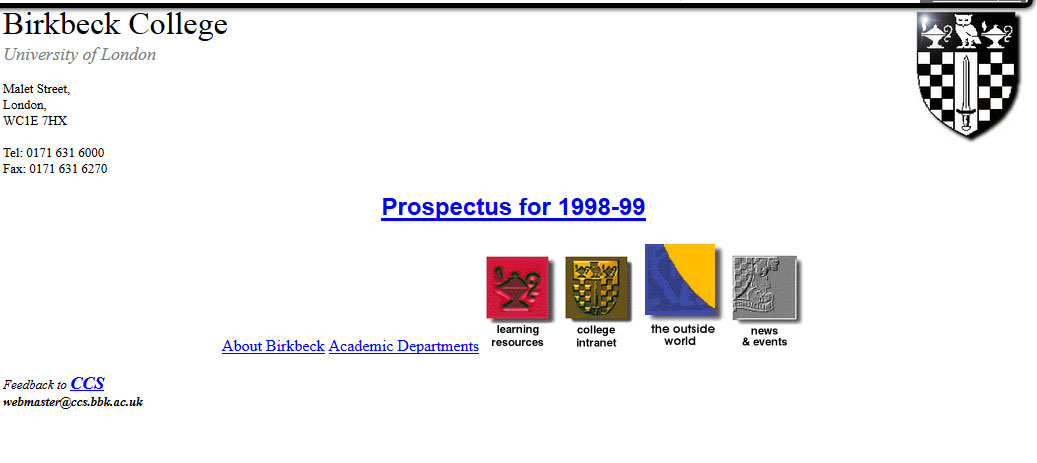 At that time, we didn’t ask people to scroll, but our website was tiny and not even the place most people turned to find out about us. Imagine this – Google was only founded in 1998! Like many other websites in the 90s, it mostly comprised text that was uncomfortable to read on screen.
Now, thanks to the proliferation of devices with small screens that people use to access the web, along with advances in readable screen technology and the advent of social media channels that require you to scan lots of content, people have not only learned how to scroll and read online, but scrolling has become the norm. This means we no longer have to put all of our most important information above the fold – indeed, we’re no longer expected to – which means we can be more flexible when it comes to homepage design.
Where did the carousel go?
Since we launched the new homepage, some people have mourned the loss of the carousel – the sliding set of images that used to adorn the top of the homepage. They are concerned that, with the loss of the carousel, we no longer convey the unique character of Birkbeck at a glance.
When we were working with Pentagram, our design agency, to develop our new homepage, we had long discussions about whether the carousel should stay or go: we were initially resistant to the idea of losing it. After all, it was an efficient way to showcase lots of information about Birkbeck in one space, wasn’t it? Actually, no it wasn’t.
It turns out that web carousels aren’t working for website users, but internal audiences love them. So, while we thought people were finding out all about Birkbeck from the rotating images and messages in the carousel, in fact, our visitors weren’t interested at all: they did not always see them; scrolled past them; went straight to our course finder; or noticed just one image and followed that link. Our carousel was giving us a false sense of security and, as a result, we were not working hard enough to ensure our visitors understood what Birkbeck was about.
This chimed with findings from our customer journey mapping research, where students told us that, even though they trawled our website enthusiastically (some of them claimed to have visited ‘hundreds of times’), they weren’t necessarily aware of our core offering or our ‘unique selling points’, in marketing parlance.
For example, some did not realise we offered evening teaching as the norm: they thought it was just an option and that we were a daytime university. Nor did they realise how well respected we are for our research, both nationally and internationally. Or that our NSS results can really shine. Our researchers told us that we ‘hide our light under a bushel’ and we absolutely needed to do more to share our unique characteristics and our successes with our web visitors, the majority of whom only ever engage with us online.
Our new homepage design
When we commissioned Pentagram to come up with a new web design with and for us, based on our new visual ID, we knew we wanted to showcase Birkbeck effectively. We knew – because Birkbeck staff and students told us – that the Birkbeck website didn’t work for our visitors as well as it might and that it looked dated and staid.
Pentagram took time to understand our objectives, our concerns and the feedback we had received from staff and students before devising this list of design principles to inform our new web design:
- Simplify and clear away clutter
- Push up content and reduce steps
- Connect content and surface a story on every page
- Create hierarchy
- Don’t be afraid of long pages
We know that people don’t read every word on our homepage – in fact, not everyone sees our homepage but goes straight to a particular page as directed by a search result. But if our visitors do choose to travel down it (and a lot of them do), they will encounter a number of elements that tell them more about the type of institution Birkbeck is:
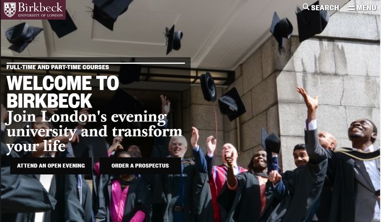
- Hero image: this is the big image that loads whenever someone visits our homepage. We have deliberately chosen an image that is both large and striking, because we know this is one way to attract the attention of our visitors and, yes, encourage them to explore. But it isn’t just the size and quality of the image – this image also conveys something about Birkbeck, buttressed by the message ‘Join London’s evening university and transform your life’. And now that we have one image to grab people’s attention, we make sure it works hard. (For example, one of our previous images – a bus driving past the SSHP buildings in Russell Square – tells people that we are in the heart of historical London.)
- A prominent course finder: we have emblazoned our course search across our homepage, after the hero image. Why? Because the art of a successful homepage is to enable visitors to get to where they want to go, quickly. In the last academic year, people pulled up our course information 6m times, so we know this is important to them. Our course finder makes it quick and easy for them to find our course information – and by including all the level options, they can see that our courses span the breadth of higher education offerings.
- Research stories embedded across our site: We are proud of Birkbeck’s research profile and know how important it is to Birkbeck staff that we tell people about it. To help us share our research stories more widely, we have embedded news, events and blogs/podcasts on all of our landing pages – not just our homepage – including our course listings. This means our research information – which comprises the bulk of these channels – is accessible almost anywhere people travel on the redesigned pages – and by showcasing our research through these different channels, we are giving people loads of ways to engage with it.
- Obvious USPs: no more hiding our light under a bushel. Our new image-based ‘statement tiles’ give us the chance to tell visitors about Birkbeck and what makes us unique. On our homepage, for example, we tell people that ‘Birkbeck is different: our classes are held in the evening so you can fit study into your life and build your future’. But this isn’t the only message on our site (because we know that our homepage isn’t the only place people look for information about us) – on our ‘About us’ landing page, we tell visitors that Birkbeck is ‘A leading research university and vibrant learning community’; and so on. If someone engages with our website, they should be in no doubt that we are a unique evening teaching institution with a world-class research reputation, and our statement tiles are designed to reinforce this message.
But that’s not all. In addition to these elements, you will find that we offer routes to destinations across our site through large visual signposts; that accessibility is at the heart of our design and our Reciteme bar means all visitors can access our information more easily; and that our redeveloped pages are responsive, which means they change, depending on the size of the browser you are using to access them, in order to provide an optimal browsing experience.
Is our homepage working the way we wanted?
Two of the objective set for Stage 1 of the Digital Transformation Project were to:
- Support student recruitment by making it easier for prospective students to navigate our site.
- Better promote our research.
Since the new pages and design went live on 16 May, we have seen a number of results that suggest that we are meeting these objectives. For example, compared to the period immediately before the go-live, prospectus requests have gone up 200%, Open Evening registrations 70% and applications 50%. And we’ve seen a 130% increase in views of our research content.
Of course, we know these results aren’t solely due to the work we did on the web, as these objectives are shared by colleagues across the college, and we work collectively to achieve them. However, we can at the very least be reassured that our website is helping us to meet these objectives and, as we track user engagement with our site (through user testing and the use of online tools like Hotjar), we can see that it is now easier than ever for our users to find the content they need to decide to study with us – and we can also see that they are engaging with our content in the way that we hoped (watch this video of someone reading our home page).
It’s early days and there’s still a lot to do and a lot to learn – but the work undertaken so far has greatly improved the website for our users and who are now able to quickly and efficently find out about Birkbeck and what we offer.

Great insights – thanks for sharing Jane! This chimes with us at the Universtiy of London as we go through a similar transformation of our website. I can relate to a lot of what you have discovered at Birkbeck. I’ll be paraphrasing your article over the next few months!
Thank you for offering these insights into the decision-making behind the new website – it is absolutely fascinating.
I’m very excited as I’m lucky enough to be involved with moving the Birkbeck Library site to the new design – I’m a Library Assistant in the Disability and Dyslexia Support team at the Library. I’m really keen on the structured data and accessibility approaches used in the new design. Would love to know more 🙂