Elizabeth E. Charles, Assistant Director of Library Services, discusses the redesign of the library website.

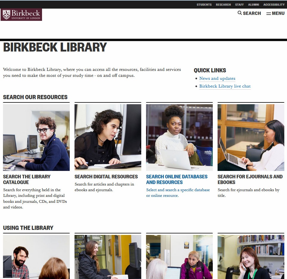
Today, we have launched a brand-new Birkbeck Library website, with completely revamped content, navigation and design.
The Library website has been redesigned on two previous occasions: we changed the landing page, but the content remained the same, which is like repainting your front door and landscaping the front garden, but doing nothing to the interior of the house! I hasten to add that this occurred because, every time the opportunity arose, we just didn’t have the time and it was too close to the start of another academic year.
This time, we asked Naomi Bain, the College’s user experience (UX) expert, to undertake some UX testing with Library website users. This told us some things that we already suspected or knew – there was too much text on the Library website, and it was difficult to find information – but, we also learned that the layout was confusing, alongside a number of other issues.
We knew that the main Birkbeck site had been redesigned and restructured and we liked some of the features, as did our users; so, I contacted Jane Van de Ban, Web Content Manager in External Relations, with a list of the things we would like changed on the Library website. As the Library site is the second most popular section of the entire Birkbeck website (after the online prospectus), Jane suggested that, rather than simply update our existing site, it would be worth integrating it into the new design. She asked us whether we would be prepared to undertake this as a collaborative effort. The Library web editors agreed that this would be a good opportunity to refresh our website, so we said yes!
Getting ready
Jane supplied us with a content audit and looked at traffic to the Library website in the past year. This showed us that a large proportion of the Library site was not being used, and it also told us which content was most popular with our web visitors. Jane presented us with a collaborative spreadsheet, listing all the content areas, and her advice on what to do in relation to each area. After the initial emotional reaction, we reviewed the comments and suggestions and either agreed with them or explained why we disagreed with her assessment.
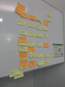
 The next step was to come up with a new structure for the Library website. We were invited to a Library web workshop and, using post-it notes and sharpies, we wrote down the most common queries that we get from our users (one query per post-it note). Then we stuck them on the wall, and grouped and sorted them. We then filled in the gaps and took pictures of the grouped post-it notes for future reference. This then became the basis of the Library redesign, alongside the initial, annotated content audit.
Jane then set up a project on Trello – a collaborative project tool – with a list of tasks, organised into columns like ‘To do’, ‘Doing’, ‘To review’ and ‘Done’.
The project
Given the importance of this project to our web visitors, Jane wanted to complete the improvements as quickly as possible and asked if a member of Library staff could be seconded to the project. I volunteered, as I felt I was best placed to answer queries. So, for one day a week, starting in early April, I was scheduled to work on the website. As homework, I had to familiarise myself with Birkbeck’s Style Guide and tone of voice guidelines, as well as other support materials provided in the digital standards section of the website. I also attended a bespoke training session, run by the External Relations web content team, then prepared to set to work.
Using the Trello project board, I chose the content areas I wanted to work on (everyone works from the same board, which means that there is no duplication of work), and my job was – for each content area – to answer the queries that came out of the Library web meeting, find all of the pages on the live Library site that related to them, then review the content and rewrite it, to meet the digital standards and to reduce the amount of text.
My first task: getting membership under control
I decided to start with our membership information. My challenge was to convert 55 separate pages to one page. Working with Ben Winyard, Senior Content Editor in External Relations, who gave me one-to-one training and advice, I rewrote and changed the formatting to match the house style, then experimented with how the information is presented.
Jane then reviewed the new page and wrote a detailed report on the format, the tone of voice, grammar and house style – I felt I had received a C+, ‘Could do better’ mark! I worked through Jane’s detailed report, addressing each point raised and making changes as necessary. This was helpful because it meant I could then review other pages to ensure the same issues didn’t crop up.
The new membership page was then moved to Ben’s list on Trello, to check that it met the requirements for the Birkbeck tone of voice and the use of plain English and active voice. He cut the text even further while ensuring that the content flowed. Then, the page was given back to me, to check that nothing crucial was missing, giving me another chance to suggest other edits.
This process meant that I received a crash course in writing for the web from a team of experienced content editors, working collaboratively, using live content. It is all well and good to read guidance notes, but quite another thing to implement them and keep to the task!
Improvements
Rewriting content wasn’t the only improvement we made to the Library site. We also improved navigation and findability of content:
- We didn’t duplicate information that already existed elsewhere – we linked to it.
- Forms to suggest new books for the Library and for staff to request teaching materials were converted into Apex forms and located either in My Birkbeck for Staff or in My Birkbeck for Students. So, Library users do not have to retype personal information that we already hold about them.
- We also made huge improvements to navigation in two key areas of content:
- Angela Ashby, Digital Editor in External Relations, reorganised the navigation for past exam papers, which had included a separate web page for each department for each year of exams – amounting to more than 200 pages. Angela cut the navigation down to 26 pages – one for each department.
- I compressed 232 web pages listings our for databases and online resources into just one page. This was made easier by deciding to move extensive help guide information for each database into a document, which will eventually become a support manual for Library staff on the helpdesk.
Keeping Library staff updated
This has been the first opportunity I have had to fully examine the content of the existing Library website and to undertake a root-and-branch review. I focused on thinking always of what our users want/will be looking for and trying to ensure that they can visit a web page, scan it, easily find what they need, and move on. Helping users to find the resources they need without adding additional layers of unnecessary content was very important. When in doubt, I would look at the website traffic figures, the feedback from the UX testing, and the post-it notes.
After all that work had been done, the slimmed-down website was shown to Library staff and to students who attended a Student-Library Partnership meeting. The response was very positive: obviously, we were on the right track.
Creating the wayfinding page
The wayfinding, or landing, page was the last component of the project. We had more post-it-note sessions with groups of Library staff to consult with them. This enabled us to come up with an initial layout, based on a top-task analysis, to inform the order in which signpost tiles appear.
Then, I built the wayfinding page. We decided to use new photos taken last year, focusing on images of our students using the Library.
Redirects
Before we could go live with the new website, we had to create a comprehensive list of redirects, to ensure visitors following old links ended up on new content. This was a huge task, which ended with 1700 redirects (and, wouldn’t you know, I also got to help with that, too).
Looking forward
We have already requested UX testing to ensure that we have not overlooked anything, to pick up on any issues, and to provide evidence to make informed decisions on any further changes/tweaks to the Library website before the beginning of the 2018–19 academic year.
Conclusion
It has been a challenging and stimulating experience. But, I have learnt a great deal from the External Relations web content team and I can honestly say, I now understand what is required to write for the web in a consistent and engaging fashion. I’ve also learned the importance of optimisation for search and paying consideration to where our users would expect to find the information they are looking for. I also know the whole of the Library website intimately, and I will continue to learn and retain my newly acquired skills, through continuous practice and actively reviewing the content on our website.
My thanks to Jane, Ben, Angela, Emlyn, Steve, Naomi, John and Outi and the Library Web Group and the Library staff for their support and for providing feedback at the drop of a hat.

