Joseph Brooker on Maps and the 20th Century: Drawing the Line at the British Library
Joseph Brooker on Maps and the 20th Century: Drawing the Line at the British Library
The British Library currently displays a large selection of maps from the 20th century. The maps are sorted into the themes: Mapping a New World (a general section, with emphasis on the diversity of points of view shaping maps); Mapping War (showing strategic plans of battle, maps used on propaganda posters and as practical tools for combatants), Mapping Peace? (maps in post-conflict situations, sometimes representing political settlements and redrawn borders), Mapping the Market (maps indicating economic activity) and Mapping Movement (maps in various ways suggesting dynamism: some mapping transport networks, some seeking ways to represent the movement of people or even of land itself).
The blurb for the first section concludes that ‘To read a map, we need to understand why it was drawn in the first place’. That points to a general theme: that maps are not neutral but partisan, and hence depict the world in different ways. That would be a good corrective to any too credulous faith in maps’ universality, but as a standard-issue academic starting point it might jostle interestingly with the facts of how much twentieth-century maps do have in common. Most maps in the exhibition are visual renditions of space on Earth as though viewed from above: if not literally, from a satellite camera, then implicitly, with what is ultimately (in the long run over the Earth) a curved surface flattened to 2-D space. Some maps do approach space from an angle: like a marvellous pictorial guide to Yorkshire with every town’s distinctive sites and characters on show, and a US map from the Second World War in which Europe, prior to an Allied invasion, is strategically viewed from the perspective of North Africa. But even these cases can’t fully depart from the sense of map as overview of space.
The other thing that most maps here agree on, despite their partisan anglings, is the actual shape of the land masses depicted. Africa never actually changes shape to look like North America. The ragged details of coastlines and topography are rendered in increasing detail, and once discerned they remain consistent when a map chooses to depict them. So it’s perhaps not just that all maps represent choices and interests, but that these interact with extensive consensus about the physical shapes being drawn … at least in the last century. I realize that the whole inquiry could be deepened and enriched by introducing ancient, medieval or Renaissance maps, but I think the historical limit imposed here is wise: the twentieth century alone proves to have almost more cartographic interest than one can take.
One more remarkably tenacious convention is the location of countries on a world map, with the Americas to the West, Japan and Australasia at far East. That is, far left and right of the picture, North being top – and here cartography does seem political, with the hegemonic ‘global North’ persistently in what’s arguably a position of prominence. Merely conventional as all this may be, it almost never varies on any world map in the exhibition.
The actual maps here form a long trail of glorious surprises; it took me nearly three hours to view them. They include:
- Topgraphic maps of First World War trenches.
- Iraq and Kuwait, carried by British military in the first Gulf War, showing them how to escape if shot down or lost in the desert.
- The area around Greenham Common, pointing out telephone boxes for pre-cellphone activists to stay connected.
- Sunderland shopping centre in the 1970s, complete with bus station and chain stores. I felt I should gaze at this for a long time.
- A diverse, international series of postcards containing maps – sometimes prominently, sometimes just as an item in a picture, ingeniously demonstrating their prevalence.
- The Guardian’s April Fool islands of San Seriffe.
- A Soviet map, apparently readying for a possible invasion, colour-coding military and administrative sites, of the area of … Brighton & Hove. Brighton & Hove! In 1990!
- J.R.R. Tolkien’s hand-drawn maps of Middle Earth.
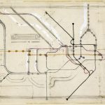
- Harry Beck’s original sketch (1931) of the London Underground (right), modelled on an electric circuit. Much we now know is absent, but you can discern the ideas of Northern, Central, District and Bakerloo Lines.
Simply to encounter these items, one after remarkably another, is repeatedly enthralling, as each arrives in front of you from its own unique journey through time and space.
By Joseph Brooker, January 2017
Thank you for this reminder of the exhibition, on until March 1st.
“‘To read a map, we need to understand why it was drawn in the first place’. That points to a general theme: that maps are not neutral but partisan, and hence depict the world in different ways.”
I never understood this so clearly as when I first came across the Hereford Mappa Mundi: a map from the 1300s with Jerusalem at its centre, which helped inform my thinking about maps ever after.
http://www.themappamundi.co.uk