- A copy of James Gall’s book from 1827.
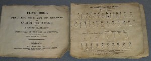
Borrowing from the narratives of origin and progress that characterise the nineteenth-century discourses of embossed literature, let me briefly detail my own first encounter with this material. Six years ago, I ordered up a copy of James Gall’s First Book on the Art of Teaching the Blind to Read from 1827 at the British Library, not quite sure what to expect. From the outside covers, Gall’s book is small, light and unassuming. The only thing that distinguishes it, perhaps, is the sootiness of its front cover: the printed letters announcing this as ‘A FIRST BOOK FOR TEACHING THE ART OF READING TO THE BLIND; WITH A SHORT STATEMENT OF THE PRINCIPLES OF THE ART OF PRINTING AS HERE APPLIED TO THE SENSE OF TOUCH’, are smudged, wearing away in places. The book has a sense of fragility: the cover paper is brittle, flaking at the edges, the stitching coming undone. The text though, is in bold, black print: so far, so ordinary.
Turning the first page, a notice for ‘Bibles for the Blind’ is printed on the inside of the front cover, proposing publication by subscription the Gospel of St John in three volumes super-royal octavo, at the price of one guinea for subscribers. This notice promises something similarly miraculous to St John’s gospel in which a blind man is restored to sight: that blind people will be able to ‘acquire the capacity of reading in a few days’, owing to the simplicity of the embossed system. This miraculous hard sell becomes, I learn, central to embossed alphabet inventors’ promotional strategies. This is followed by further printed text: James Gall’s statement on ‘the art of printing for the blind’ (of which more shortly). That this experiment is clearly driven by evangelical concerns is stressed by the book’s closing notices, printed in ink on the back cover, which advertises two of James Gall’s publications: A Clerical Record, for Parishes and Particular Congregations; with an Introduction […] and The End and Essence of Sabbath School Teaching, and Family Religious Instruction.
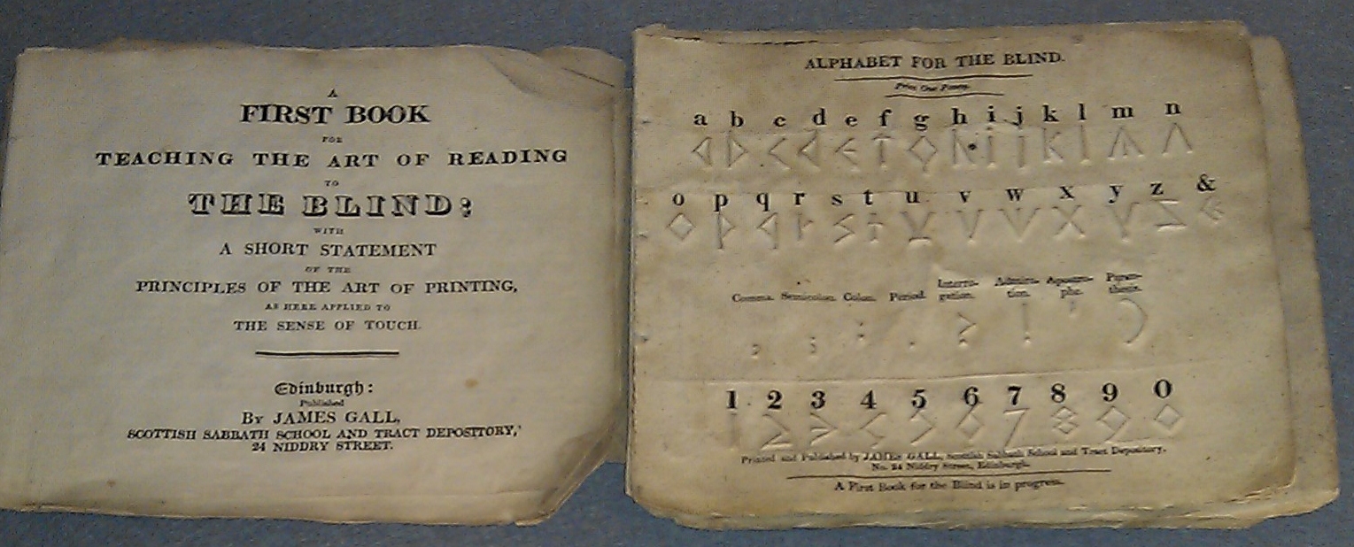
At the end of the statement on printing for the blind, we find Gall’s embossed alphabet code, consisting of two lines of printed alphabet characters in lower case, with Gall’s embossed letters beneath. The characters visually correspond to the Roman alphabet letters, but have sharper angles: the curves of a, b, c, etc, transformed to triangles. The raised letters are sharp enough to have made indentations on the facing page. Touching the letters, the sharpness of their lines is satisfying to the fingers, but as a sighted researcher, I am still guided by the visual appearance of the letters. Their tactual distinctness is harder to identify. Turning the page, the paper is thicker than Gall’s printed statement, feeling more like weighted card than paper. The next page contains the alphabet with no corresponding visual alphabet. It also compares the sentence ‘King of Jerusalem’ in Gall type to the French embossed Roman script. The French looks pretty to the eyes, gently swirling strokes of letters resembling a neat, handwritten script – but it feels far more muddy to the finger. Turning the pages again, the ‘First Book’ consists of, we find, the Lord’s Prayer in embossed characters, followed by the Creed. Pages have been stuck together to allow for continuous text (embossing on both sides was not yet possible). Again, I read the text by eye, the typographical design and sculptural quality of the letters aesthetically pleasing.
Closing Gall’s book opened up not only new research questions for me, but also issues concerning my critical method and approach. Up to this point, my research had been concerned with standard textual and printed sources that depicted blind people and fictional characters: published biographies, fictional works, charitable reports. In these sources, the question of representation of visually-impaired identity is particularly fraught: mediated variously through lenses of pity, fear, and sentimentality. Some of the biographical material published by blind people raised other questions for me around the mediation of voice. Accounts by blind individuals such as James Wilson, John Bird and Edmund White are mediated by another’s eyes and hand as their blind authors relied, a la Milton, upon amanuenses to transcribe their words and participate in nineteenth-century publishing culture.
James Gall’s First Book invited another set of questions, which were enriched by more research into the significant number of embossed books produced by both Gall and his British competitors: Dr Fry, John Alston, James Frere, T. M. Lucas, George Hughes, and William Moon, to name the most significant. How did the experience of text change for blind people in the nineteenth century? In what ways did having direct access to means of textual consumption and production affect blind people’s sense of self and identity, and enable them as authors? As the blind author of a piece titled ‘Blind Leaders of the Blind’ in All the Year Round put it in 1870 (a key year for embossed literature in Britain) ‘if the ability to read be essential to the welfare of a human being who can see, how much more so is it to all who have “wisdom at one entrance quite shut out”!’ In a culture in which increasing emphasis is put on the role of literature in the formation of social identity, being literate counts in new ways.[1]
Gall’s statement suggests how the relative privileging of vision over touch limited early ambitions for blind people’s literacy, as he stresses that ‘the grossness of the sense of touch when compared with that of sight, precludes the idea of this art, as applied to the Blind, ever attaining any high degree of comparative perfection. Their Books, both in regard to size and convenience, must always labour under many disadvantages […]’. Whilst in related philosophic and scientific discourses new attention to touch was opening up the tactile perceptivity of the finger, skin and nervous system, an anxiety about the inferiority of touch to sight continues to resonate throughout the early history of embossed literature by sighted people.[2] Materially, this contributed to a persistence amongst early educators for a raised alphabet system based still on the Roman alphabet, and hence legible to the eye.
The theorisation of touch was however far from static in the nineteenth century. By 1872, a blind character in a serialised novel by a mainstream author, Wilkie Collins, declared scornfully “You people who can see attach such an absurd importance to your eyes! I set my touch, my dear, against your eyes, as much the most trustworthy, and much the most intelligent sense of the two” (Poor Miss Finch).[3] Collins’s novel – as he pointed out in the preface to the first published version – ‘carefully gathered the information necessary to the execution of this purpose from competent authorities of all sorts’ (p. xxxix). This included eighteenth-century philosophic and medical texts exploring the issue of sight restoration to the long-term blind (George Berkeley’s New Theory of Vision [1709] and William Cheselden’s account of the surgical removal of a young man’s cataracts, published in Philosophical Transactions, 25 [1728]). Collins also however engages with a more positive tradition which detailed tactile experience from the standpoint of blind and visually-impaired people, including Denis Diderot’s instrumental Essay on Blindness (1749). He also draws on the cultural zeitgeist mentioned above, the early 1870s being a point at which blind people publicly began to assert control over embossed literature. As detailed in the exhibition (objects 19 and 20), the British and Foreign Society for Improving the Embossed Literature of the Blind was set up by blind and partially-sighted men including Thomas Rhodes Armitage, James Gale, W. Fenn and Daniel Connolly to investigate and determine the best raised finger reading and writing system. And as Mary G. Thomas cites in her 1952 biography of Thomas Rhodes Armitage, the guiding principle of the committee was that ‘the relative merits of the various methods of education through the sense of touch should be decided by those and only by those who have to rely upon this sense.’[4] Blind writing practices were part of, and contributed to, a rewiring of the nineteenth century sensory hierarchy.
Heather Tilley, Exhibition Curator
[2]For example in studies from the emerging discipline of neuroanatomy – Charles Bell, The Hand: Its Mechanism and Vital Endowments, as Evincing Design (1833) William B. Carpenter, Principles of General and Comparative Physiology, intended as an introduction to the study of human physiology, and as a guide to the philosophical pursuit of natural history (first edition 1841, republished 1841, 1851, 1855); and pyschophysiology – Alexander Bain, The Senses and the Intellect, 1855).
[3] Wilkie Collins, Poor Miss Finch (1872), ed. by Catherine Peters (Oxford: Oxford University Press, 2000), p. 220.
[4] Mary G. Thomas, N. I. B. Biographies: Thomas Rhodes Armitage (London: National Institute for the Blind, 1952)
Dear Heather
You write that
‘At the end of the statement on printing for the blind, we find Gall’s embossed alphabet code, consisting of two lines of printed alphabet characters in lower case, with Gall’s embossed letters beneath.’
How far did embossed books use the dual alphabet and how far use either all lower case or all upper case? And was there discussion of this issue?
Gavin
Dear Gavin
Many thanks for your comment. Embossed Roman scripts tended to use a singular alphabet, although Hauy’s first French script used a dual alphabet. Those using upper case include Fry, Alston, Klein. Boston Line type used lower as did the modified Gall from the early 1830s (though some class books continued to incorporate some capitals). With regard to arbitrary systems, Moon adapted the upper case Roman script, although a couple of letter characters (b and f) were based on lower case.
There was some discussion of this. For example, Gall discusses the benefit of using lower case letters in terms of tactile ease and space saving (he mentions this in the 1827 statement and also in ‘A Historical Sketch of the Origin and Progress of Literature for the Blind (1834)). John Alston praised Fry’s alphabet for using capitalisation in 1836, as he set about developing his own embossed system.
Heather