Tag Archives: university

Starting university: tips to manage the transition and be a successful student

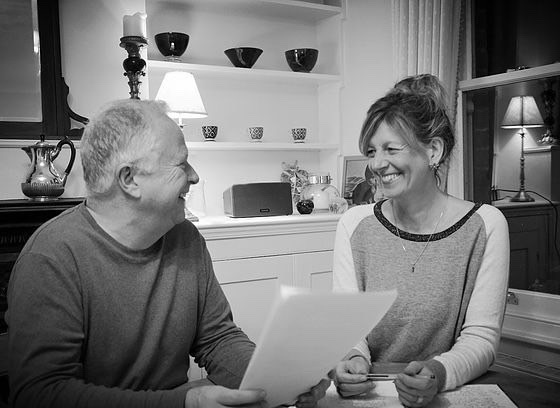
Hanneke Kosterink, Counsellor and Supervisor at the Birkbeck Counselling Service offers advice for students managing the transition to university, and explains how visualising success can help you achieve it. 

The transition from school to university brings a range of new experiences and challenges.  During this transition period, it is essential to find the right balance between studying and everything else including:

  • getting to know the university
  • settling into your course
  • learning what is expected of you as a student
  • discovering activities and social opportunities
  • making new friends

Academic Challenges
Many students enjoy the intellectual challenge of university study, opting for courses and subjects that match their interests. However, adapting to academic study and understanding what is expected of you as a university student can be an intimidating experience and will require taking responsibility for your own learning, managing your workload and completing assignments to strict deadlines. This requires self-motivation and dedication.

In addition to making good use of the support services and study resources your university provides it may be helpful to learn the technique of visualisation to reach your academic goals.

Writing over 2000 years ago Aristotle described the visualisation process this way:  “First, have a definite, clear, practical ideal; a goal, an objective.  Second, have the necessary means to achieve your ends: wisdom, money, materials and methods.  Third, adjust all your means to that end.”

Unfortunately, many of us remain stuck at the goal stage.  We start out with good intentions and perhaps a plan, but then we can’t seem to make it happen.  A hectic social life, job, hobbies, anxiety leading to procrastination can get in the way of achieving your academic goals.

Seeing is believing
Before we can believe in a goal, we first must have an idea of what it looks like. To paraphrase the old adage: we must see it before we can believe it.  This is where visualisation comes in, which is simply a technique for creating a mental image of a future event.  When we visualise our desired outcome, we begin to ‘see’ the possibility of achieving it.  Through visualisation, we catch a glimpse of what is our preferred future.  When this happens we are motivated and prepared to pursue our goal.

In the world of sports, this has been developed into a well-researched method of performance improvement.

How do well known British sportsmen and women use visualisation?

Wayne Rooney
Footballer Wayne Rooney is a firm advocate of mental preparation and the visualisation technique. “I lie in bed the night before the game and visualise myself scoring goals or doing well. You’re trying to put yourself in that moment and trying to prepare yourself, to have a ‘memory’ before the game.” Rooney sees his approach as fundamental to his sporting success. “I don’t know if you’d call it visualising or dreaming, but I’ve always done it, my whole life.”

Jessica Ennis-Hill
Ennis-Hill revealed her mental training tactic prior to the 2012 London Olympic Games: “I use visualisation to think about the perfect technique. If I can get that perfect image in my head, then hopefully it’ll affect my physical performance.”

Andy Murray
In order to mentally acclimatise before a major event, Andy Murray visits the centre court when the area is deserted and imagines his future success. “I want to make sure I feel as good as possible so I have a good tournament.”

Applying it to your study
There are two types of visualisation which ideally should be used together.  The first method is outcome visualisation and involves envisioning yourself achieving your goal.  To do this, create a detailed mental image of the desired outcome using all of your senses.

Let’s start with the big goal: getting your degree and attending your graduation ceremony.  Visualise yourself on graduation day receiving your qualification with a good pass.  Hold that mental image as long as possible.  What does it feel like walking across the stage in your robe to collect your certificate from the Master?  Who will be there accompanying you in the audience to cheer you on when it is your turn?  Imagine the pride, relief, satisfaction and thrill as you hug your loved ones before heading for the marquee where the photographer is waiting to capture that special moment in your life.

Visualising how it might feel to graduate might help you to plan your studies and your time at university. 

The second type of visualisation is process visualisation.  It involves envisioning each of the actions necessary to achieve the outcome you want.  Focus on each of the steps you need to achieve your goal, but not the overall goal itself.   What are the demands and deadlines you will need to meet?  Create a vivid mental picture of yourself succeeding, envision what you must do during each step of the process and like Rooney, Ennis-Hill and Murray use positive mental imagery to stay focused and motivated when you experience obstacles or setbacks.

Visualisation does not guarantee success.  It also does not replace hard work and practice.  But when combined with diligent effort and a strong support network, it is a powerful way to achieve positive behavioural change and create the life you desire.


Share

100 letters changed my life

When Alison Hitchcock decided to write a letter to a friend after he was diagnosed with cancer, she had no idea it would lead to a new venture and an MA in Creative Writing at Birkbeck. She writes about how these letters changed her life. cancerlettersBack in 2010, I would never have predicted that when my friend, Brian Greenley, was diagnosed with bowel cancer, the letters that I offered to write to him would change both our lives.

In 2009 Brian and I had met on a yoga holiday in India. We got on well, both equally inflexible and neither of us able to do a headstand, but we had little else in common. I was a City career-girl, and Brian had recently taken voluntary redundancy and was thinking of setting up his own gardening business. We met up a couple of times back in the UK, but neither of us would have described ourselves as anything other than acquaintances. When Brian shared that he had been diagnosed with cancer, perhaps because I didn’t know what to say, I offered to write letters to cheer him up. Looking back, I’m not sure what possessed me – I was no writer. But a promise was a promise!

The letters began and over the next two years, as Brian’s cancer developed to stage four, I kept on writing. I surprised myself, finding that I cherished the time I sat alone and wrote. It felt good to be doing something for someone else and it removed the feeling of helplessness that friends so often feel when a loved one becomes ill.

My enthusiasm for writing was bolstered by Brian’s response to receiving the letters. He once said: ‘Knowing that someone is caring enough to write, buy a stamp and put the letter in the postbox means so much. Your letters help me to feel reconnected with the real world.’

Enthused by my newly discovered passion for writing, I attended an Arvon Starting To Write course and began to understand what it means to want to write. From then on, as for so many who attend Arvon, everything changed. I wanted to write more and learn more. My letters continued but Arvon had given me an appetite for writing and letters were no longer enough, so I applied to Birkbeck’s Creative Writing MA. The MA not only confirmed my love of the writing process, it gave me confidence to explore different styles. By the time the course ended, I had had short stories published, written a novel and become involved with wonderful literary organisations such as Word Factory.

cancerletters2

At the end of 2016, Brian and I were recorded for Radio 4’s The Listening Project. Such was the response to our story, we set up From Me to You, a charity which inspires people to write letters to friends with cancer; keeping them connected at a time when they feel most disconnected. At From Me to You we run letter writing workshops, speak at events and our website hosts writing tips on what to say and how to say it, and shares many inspirational stories from those who have received and sent letters.  Recently we have expanded the initiative so that people can write letters to cancer patients they have never met. The communications range from postcards and notes that say something as simple as ‘keep strong’ to longer letters recounting tales of everyday life. These letters are acts of pure kindness. There is no obligation on the recipient to write back.

Brian never responded to any one of my 100 letters and I never expected him to. The letters had given me the gift of writing and a whole new life. That alone was, and still is, more than enough.

Contact details for From Me to You:

Share

The story behind Birkbeck’s new web design

Dr Ben Winyard, Senior Content Manager at Birkbeck explains the research and process behind our website’s new look. 

The Birkbeck website serves many vital functions simultaneously: it must be an authoritative, accurate source of information; a gateway to services; easy to navigate and search; aesthetically pleasing; accessible to all; and it must reflect and advance Birkbeck’s mission. The experience of using our website is often absolutely central to a person’s decision to come and study in the evening with us.

In our digital age, having a professional, beautifully designed and practical, easy to use website is absolutely essential for any university or organisation. Users need to get where they want to be quickly and easily, feeling confident that what they’re reading is accurate, while enjoying the tactile and visual experience of moving through our site.

The Birkbeck Digital project is a hugely ambitious, wide-ranging and on-going project to redesign, redevelop, restructure and re-present Birkbeck’s web presence based on research, evidence and over 50 user-testing sessions. Every longstanding website – and Birkbeck has been online for around twenty years – has a natural history of expansion and growth. The ambition of this project has allowed us to research and reconsider everything about our site – the design, the layout, the navigation and the content – and the opportunity to field staff and student feedback to ascertain how people use, and feel about, our website.

The project has been divided into stages, as the Birkbeck website extends to many thousands of pages. Stage 1, which is being delivering on schedule this month, includes the redesign of the Birkbeck homepage, of our ‘corporate’ site, which includes all of the key information for prospective students and covers many of our most important professional and student services departments, and, lastly, the online prospectus, which includes over 3000 pages of course and module information across all levels of study, from short courses to PhD research.

Our first task was to organise user feedback sessions, to help us map and improve the experience of visitors to the website. A series of workshops, one-to-one interviews and group sessions, were bisected by ‘type’ of user, from ‘young undergraduate’ and ‘mature postgraduate’ to international students, MPhil/PhD researchers and staff from across the College.  From this research we were able to compile a rich analysis of who is using the Birkbeck website, what they are looking for, and what delights and frustrates them. This invaluable feedback has informed every step of the design process, the reviewing and refreshing of content and the build of the new website.

The feedback was often interestingly divided according to the age of the student: in general, users above the age of 30 were positive, describing our website as ‘modern’, ‘clear’, ‘precise’, ‘professional’ and ‘mature’; while younger users were less positive, describing our website as ‘traditional’, ‘outdated’, ‘plain’, ‘dull’ and lacking colour and media content such as videos. Many users expressed frustration with the navigation on our site – the menus, signposts and links that you click on to move from one page or section of the website to another – and felt we don’t adequately convey what it is like to study at Birkbeck. Users also struggled to access vital information, including bursaries and financial support.

Embedded accessibility software, including screen-reading, enables visitors to customise our site in the way they need it to work

Embedded accessibility software, including screen-reading, enables visitors to customise our site in the way they need it to work

The task of converting all of this, sometimes conflicting, feedback into a new design fell to the design company, Pentagram, who created our new visual identity last year so had a head start in understanding Birkbeck’s unique mission and our diverse staff and student community. Over the course of many brainstorming sessions and meetings in the autumn of 2016, Birkbeck’s content (External Relations) and technical (IT Services) experts worked together with Pentagram to translate our new visual identity and user feedback into a stylish, clear and colourful new design.

The mammoth task of translating Pentagram’s beautiful designs into a functioning website fell to our hugely talented and hardworking CIS & Web Team in IT Services. This type of translation work – of turning a design into functioning code on a webpage – will always involve cutting your coat to match your cloth – i.e. working out what can be done given the challenges of schedule, staff capacity and budget. The developers were astute at breaking down each element of the design and explaining the best way of turning them into a digital reality. Extensive user-testing was carried out in the team as well as research to makes sure our site is sector-leading in terms of accessibility. This sort of cross-team working carries its own challenges, but IT Services and External Relations have worked strongly and successfully together.

The new pop-out menu

The new pop-out menu signposts visitors to important pages

This new design has adapted our visual identity for the Web, incorporating new typography and standards of layout. On the redesigned Homepage, we now have the images, clear, graphic signposts to important pages that users have asked for, brought together on a new, easy-to-use pop-out menu on the right-hand side of the page.


Finding a course is usually the number one task of a new visitor to our site, so we have incorporated a prominent keyword course search box at the top of the Homepage, to get students started on their journey as quickly and easily as possible. We’re also showcasing the best of what’s happening at Birkbeck – as a lot of user feedback articulated a sense that Birkbeck is ‘hiding its light under a bushel’ and not trumpeting its achievements and strengths. So we are featuring news, events, blog posts and podcasts on the Homepage and on landing pages, singing loudly and proudly about our world-class research.

research-tile

Birkbeck’s unique qualities are showcased with eye-catching statement tiles

Birkbeck’s unique mission makes us genuinely different to other universities and the new website is all about making this clear upfront, celebrating it and helping prospective students see the many ways in which studying with us could have a real impact on their lives. We are also making videos more prominent, as a way of telling our unique story and dusting away some of the fustiness that frustrated our younger users. Finally, the new website has been designed responsively, meaning that, whatever device you are using, the website will look great and be easy to use.

newwebsite6phone

The website is optimised for browsing on any device

On our online prospectus, we are presenting each course page as a gateway into Birkbeck, as many prospective students come to our website through our course pages after a Google search. Thus, we now include links to important information on fees and funding, making an application, entry requirements, accommodation, our research culture and other key areas of interest for prospective students, depending on the level of study. We have also reviewed the content on all of our course pages, stripping out duplication and generic content and simplifying, consolidating and improving.

Redesigning and restructuring the website gave us a golden opportunity to review, assess and edit our content. The pages on our ‘corporate’ website include absolutely crucial information on fees and funding, student services, careers and employability, and research, while our online prospectus is the most visited area of our website and absolutely central to attracting new students.

Like most organisations, Birkbeck has seen its website expand exponentially over the past decade and, as with any large, complex organisation, content on our website has not always been kept up-to-date or focused on the needs of users. Seizing this opportunity, we have reviewed and refreshed over 1500 items of content, which includes webpages, images and files, in line with the newly created House Style and tone of voice guidelines – the first time Birkbeck has ever had a comprehensive style guide.

Duplicate and obsolete material has been removed, written content has been reviewed, rewritten where necessary, and adjusted to meet our House Style. User testing and workshop sessions with content owners across the College mean that we have been able to reorder material based on user needs, giving prominence to the material that matters most to visitors and giving answers to their most pressing questions. Areas of the website that had been structured to reflect the internal organisation of Birkbeck have been reordered to bring users’ needs, questions and tasks to the forefront. Thirty new landing pages have been created, giving essential content areas a fresh, vibrant new look that also makes the website easier to navigate.

Throughout this process, when considering the design, layout, structure and content of the website, we have been guided by the following ideas and principles:

  1. To focus on and prioritise the needs of the website users, whether staff, students or visitors.
  2. To simplify, clarify and reduce, while avoiding duplication, obfuscation and verbiage. Our written content should be truthful, clear, concise and easy to understand.
  3. To ensure our site is accessible to all users and optimised to enable disabled, blind and visually impaired users to access the information they need.
  4. To increase the aesthetic appeal of the website, particularly through the greater use of images, videos and other media. To this end, nearly 600 new images have been uploaded to the site.
  5. To simplify the structure of our website, to enable ease of navigation and quick access to the information that users need.
  6. Apply our new House Style and deploy a more consistent, positive and appealing tone of voice.

And this is just the beginning. Going forward, we will be redesigning and relaunching other parts of our website, utilising new technologies, implementing new principles of digital governance, rolling out our new House Style and tone of voice guidelines, and working towards the shared goal of a website we can all feel justly proud of.

Share

User-testing Birkbeck’s new website design

Naomi Bain, Web Officer (Training and User Experience), at Birkbeck explains the way student feedback informed our new web design. 

webOver the course of the past few months, throughout the redevelopment of the Birkbeck website, I have carried out more than 50 user testing sessions. These have sought to ensure that the changes and improvements we are making to the website are firmly rooted in research and evidence about how the website is used in real life, rather than how we might imagine it is used.

After each round of testing I reported back to the web teams, both technical and content, about any issues that came out of the sessions. These reports led to some changes being made, helped with decision-making processes and provided reassurance.

There have been four rounds of testing with students, gathered with the help of Team Birkbeck. As well as this, I set up sessions with students with dyslexia and related conditions and students with visual impairment, who I contacted with the help of the Disability Office and External Relations. The students who have participated are studying all kinds of subjects and come from a wide variety of backgrounds. Testing has included a number of older students, and students who do not speak English as a first language.

In the early stages of testing we just looked at PDFs of the new design. Students were asked for their response to the appearance of the site, and I did ‘first click’ tests to assess their understanding of the layout of the pages and how they would find something on a live version. We then moved on to testing some mock up stand-alone pages, concentrating in particular on testing the course finder and the menu.

For the final round, we had something approaching a complete test version of the new site, and focussed in particular on course information. In addition to this, students with disabilities assessed various accessibility tools, and also talked about how their disability could affect their use of websites.

All sessions took place at Birkbeck and were recorded using Panopto, the university’s video content system. All students used the site on a PC, and some also searched the site on their phone.

Feedback on the new site has been overwhelmingly positive. People described it as “clear”, “modern”, “colourful” and “engaging”. It compared favourably to both the existing Birkbeck site and to other university sites.

Observing students carrying out searches on the site enables us to quickly see whether they understand how the design “works”. Several minor issues with the design have been brought to light as a result of these user testing sessions and changes have been made, or potential problems flagged up.

The intention is to do some follow up testing post-launch, as part of an ongoing iterative process of development and improvement, which will ensure that Birkbeck sites are attractive, usable and accessible to all our students.

Share