 It’s an unusual position for an organisation to find itself in: on the brink of its third century and still no signature style. Imagine Apple without its elegant designs and simple use of space; or Google minus its primary-colours and clean white canvas.
So, just a few years shy of our 200th birthday, we thought it was time such a unique and vibrant university had the coherent and contemporary look it deserved.
What we wanted was a clear, well-considered look and feel that stands for Birkbeck, which is fortunate to possess two rare things: a real Unique Selling Point (as the UK’s only evening university) and a heritage to die for (a core mission which has remained unchanged for 200 years, of educating working Londoners).
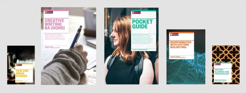
So, where to start? We had a 20 year-old ‘lockup’ – a logotype and crest, always seen together on a burgundy panel; and a blue theme inherited from a decade-old advertising campaign. We didn’t want to change the lockup (the burgundy has been darkened and the crest reversed to give greater contrast). But the older and newer looks didn’t always sit together favourably and the visual identity void led to a variety of styles that were not always recognisably ‘Birkbeck’.
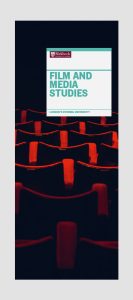 The challenge, then, was to create an identity – typefaces, colour palette, ways of presenting information – that would live happily alongside the lockup and work across digital and printed channels and products for years to come.
Importantly, the identity needed to be easy for people across the university to put in to practice. We have a small central design team, but many others across the organisation have some responsibility for design, stationery or leaflets, for instance.
We hired Pentagram, the world’s largest independent design consultancy, after a competitive process during which we were wowed by their careful understanding of Birkbeck, creative problem-solving and knowledge of the Higher Education sector having worked with the University of the Arts and the University of Sussex.
A cross-university steering group of academics and professional staff were convened to discuss Birkbeck’s personality and how it might be portrayed visually. This group became essential arbiters throughout the process, helping to define and refine ideas and schemes.
And together we came up with a visual identity that is both beautiful and practical that reflects Birkbeck’s ‘attitude not age’ approach to higher education for all – inclusive, vibrant and world-class.
Domenic Lippa, partner at Pentagram, said: “We wanted to create a visual identity that used the heritage of the existing logo. To do this, we anchored all information off of the logo, thus creating a strong hierarchy. Once we established this, the ‘heart’ of the identity, we started to introduce new typefaces, colours and imagery to support and counter-point that heritage.”
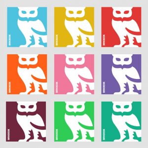 There is enough flexibility to give people across the university room to ‘play’ with the identity, for instance by an unrestricted colourful palette and playful new ways of using our crest’s iconic owl – signifying our evening study. But brief, user-friendly guidelines gently help people stay within a ‘safe space’, ensuring Birkbeck always looks the part.
Needless to say the list of products queuing up for an identity make-over is long – from signage and stationery to websites – so the process of switching our look will take some time. We’ll take it gradually. We wanted to share the design with staff and students first, of course and there will be face-to-face briefings for people who work with design and on-going support from the central design team.
Externally, the new look will be debuted by our new marketing campaign which launches after Christmas with advertisements across the London underground and buses. Our annual magazine BBK will be sent to our alumni and friends shortly afterwards, sporting the new identity. And thereafter, as we proceed throughout 2017, e-newsletters, stationery, Open Evening livery, the 2018-19 prospectus, a new website design and many other products will follow on.
Professor David Latchman, Master of Birkbeck, said: “I am delighted that Birkbeck is getting its first ever visual identity. As we move towards our third century this colourful, modern look helps communicate with the vitality, passion and professionalism of our world-class university.”
– Julia Day, Head of Communications at Birkbeck

Looks nice.
What a shame, it’s completely uninspiring and bland and looks like material from The Guardian and every other remotely contemporary media organisation, or a corporation’s annual accounts. So all that came out of all of that work and £££ was some childish colours that clashes horribly with the sophisticated burgundy, and the owl we already had. Nothing is “anchored.. off of the logo” and no strong hierarchy is created at all. It just looks like the most basic of typefaces and design was conjured up and, not knowing what to do with the Birkbeck ‘lockup’, Pentagram has made it small and plonked it in anywhere like some sort of embarrassment. A real pity, a real missed opportunity and it feels like a disservice to Birkbeck.
I endorse these sentiments. Such a pity this has been done. Bbk is hugely sucsessful; it needs no rebranding.
I recognise that all of us cannot each have a personal veto on this but I will be a little bit sadder about being a Bbk graduate and student.
Rather disappointed to see that Birkbeck has succumbed to this kind of marketing-led managerialism. As one of the world’s top 250 academic institutions and as part of the University of London (the third oldest university in England) surely the college should not be wasting money on this sort of trivia. I’m proud to be a Birkbeck graduate, and to be a Birkbeck research student, so this sort of performance makes me really sad.
Very poor. Is this really the best they could do?They have ‘dumbed down’ Birkbeck’s unique identity to that more akin to a kids’ nursery school – the “unrestricted colourful palette” is even less likely to “sit together favourably” than the old scheme. Basically it’s got no class and is just like a myriad of other so-called “modern” designs. The wonderful burgandy logo and crest thankfully remains, but how much better that would have looked framed in eg gold and richer tones rather than with colours from a child’s paintbox. The ‘cartoon’ versions of the owl are appalling.
Sounds like a load of make-work for University administrators. Birbkeck’s burgundy and targeting of working professionals demands a ‘classic’ serious look instead of this infantilised rubbish. You don’t see Oxbridge pushing minimalism – they embrace dark, rich, serious colours and push their history/crests front and centre. The fact that the procurement was done through a so-called competitive process doesn’t disguise the complete waste of money. Further, why give this to the private sector at all, when you have thousands of arts students and faculty members across the University of London? Very disappointing indeed.
Is it too late to change it back?
Another thought to add to my previous comment:
How can Julia Day possibly say that Birkbeck has never had a “signature style”? I’m not from academia in terms of profession, I studied for several degrees elsewhere, but as far back as I can remember the Birkbeck crest, the powerful burgundy, even the crisp rectangular panel, has been in my general awareness. This *is* the signature, it’s right there in front of you and has been there all along. Maybe Birkbeck management is too close to see it? It has said to the world for years that Birkbeck knows what it is, what it does best and doesn’t need to pander to any childish dumbing down like this to move forward and communicate what it’s about.
I am now at Birkbeck but if I’d seen any of this nonsense it would have put me right off. Does Julia and all those responsible for this not understand how tradition, sophistication and strength is linked with credibility? Why would I ever want to study somewhere that clearly doesn’t know who it is or who I am?
If Birkbeck is in some sort of difficulty – which is what this redesign screams out – then solve your strategic issues intelligently. Don’t succumb to this knee-jerk identity nonsense in the wrong way, and at the wrong time.
I’d urge Birkbeck very seriously to scrap this. It is the wrong result born out of obviously the wrong brief.
Quiet and thoughtful. I like the way the owls have been used to give elegance rather than childish jollity.
Its just the bland leading the bland
a vapid and pointless exercise in dumbing down like the Barclays eagle, the BP sunflower and the NHS in italics
Sadly, I see you’ve taken a bit of guff for this needed effort to bring our owl to modern times. I like it — bright colours, (invisible) crest and all — as we are not Oxford, and never, ever, wished to be!
George Birkbeck once espoused a radical notion of education. Are we so timid now we would reject of a bit of colour? Perhaps, but for me, I appreciate Birkbeck’s mission — and our continued purpose.
While our colours may ruffle some feathers, it does so rightly. Fly bravely!
I have to agree with the criticisms of this pointless exercise. It appears to be yet another corporate search for ‘identity’ when the institution already has a time-honoured presence which in Birkbeck’s case is easily recognisable.
Let’s not waste any more time on it – even better, just scrap it..
I am appalled to read that Birkbeck, which was founded to make higher education available to working people, has now succumbed to this marketing bullshit which adds NOTHING positive, but has probably cost quite a tidy sum, earned by consultants specialising in “rebranding”. Birkbeck is not a soap powder, but a place for education and learning! It does not need a new “visual identity”, that “need” has been artificially created out of nothing. What is wrong with the old logo? Having completed a BSc in the mid-1990s and several other adult education courses on diverse subjects in the following decade, I will always cherish the old logo, which stands for all the things I hold dear about Birkbeck. Birkbeck does not exist to fund Pentagram, but to make education accessible to those who have missed out elsewhere, or who want to broaden their horizons as adults. Cut this nonsense – and get back to the basics Birkbeck excels at!
One more thing: the same electronic Alumni newsletter that features this preposterous story about Birkbeck’s “new visual identity” also has a thinly disguised plea for donations under the headline “Seasons Greetings”. Do the authors really expect Birkbeck Alumni to cough up to pay for such follies as creating a “new visual identity”?! Is that where our money goes??
Dreadful the march of the MBAs I suppose, passengers become customers……Lets have a truly awful logo to match margarine etc Not Birkbeck (our founder must be spinning in his grave). I have no doubt the daubing has costa small fortune to produce even if does look like a six year olds work. So much worthwhile needs to be done rather than this nonsense…………….
I love the symbol of the owl, it reminds me of the long nights of study that have helped me to progress my goals and aspirations. I would however suggest that you use it in the BBK recognisable burgundy, to retain the sense of serious credibility of the organization. It will also then complement the existing logo.
Having read the published comments of alumni and current students the vast majority of comments deplore the changes and the costs. I wholly concur with the majority and suggest this marketing gimmick be dropped forthwith.
I am actually embarrassed by Birbeck’s tweets a couple of days ago (Isabelle Portier) using the phrase “our stunning new marketing campaign” accompanied by posters that a local council in the 1990s might have used to advertise bin collection times.
So, as we kick of 2017, we have posters at odds with the Birkbeck Twitter account with the former using the powerful existing logo, but reducing it in such a way as Birkbeck looks ashamed of it and therefore of what it is, and the latter using a pink-backed owl.
Marketing and branding should be powerful and intelligently done. It’s 2017, not 1995! This is a place of learning, not a back office council department. Posters like this are nearly 20 years out of date and are uninspirational. There is a lack of creativity and competence in this project that really takes some doing to achieve, and I find it hard to comprehend how Birkbeck and Pentagram could have got into this position where this sham was approved in the first place.
What do Birkbeck’s Officers feel about all the negative feedback?